
Evergreen
Role
UI Designer
Date
Spring 2025
Team
3 Designers
1 PM
2 Graphics
2 Developers
The Need
A landmark 4-year Dartmouth study tracking over 200 students' mental health found that depression, anxiety, and stress scores have been rising.
Evergreen is unique in its use of passive sensor data and AI to take preventative approach to wellbeing. It aims to catch mental health struggles before they become clinical.
What is Evergreen
I designed a mobile app using AI and passive sensor data to provide proactive wellbeing support for Dartmouth students.
Evergreen is a $16 million project and I worked on the project's first 3 terms. This case study focuses on the first term.
THE CHALLENGE
To conceptualize Evergreen and create a concrete onboarding flow for it.
The Design
Our onboarding focused on addressing two main pain points…
The ambiguity of Evergreen
Student distrust of AI and passive sensor data
I worked predominantly on designing the permissions screen and a "Why Evergreen" screen.
Interactive battery visual

Informs users about data-use while signaling that permissions "power" Evergreen
Student use cases

Shows relatable, Dartmouth-specific use cases of Evergreen
My Process
Phase 1: Research
Given the ambiguity of the project pitch, I began my process conducting industry and user research. I looked at a variety of apps and conducted student interviews.
Two key key insights
Streaks, calls to action, and social features are important features in popular AI and wellness apps
Students are interested in unique data visualizations
Informed by my insights, I began iterating on journaling and dashboard features.
Journal Iterations
I explored streaks, unique data visualizations, and ways to incorporate AI

Dashboard Iterations
I focused on clear calls to action, streak-based features, and new data visualizations.

Phase 2: Adapting to pivots with communication & iteration
Pivot 1: Intervention-focused features
Our partners wanted to redirect our iterations to more intervention focused features. To ensure we were all on the same page, I suggested coming up with a list of features to design. We discussed and decided to start with:
Gratitude journaling
Reflection-focused journaling
Mood tracking
I rapidly iterated to keep us moving. Based on our industry research, I focused on interactive and streak-based features. Further, following user insights, I designed for reflective journaling and explored creative data visualizations.


Pivot 2: Shift to onboarding
At our next meeting, our partners felt that the onboarding and chat interface designs were more important given the need to produce screens for promotional materials. The design team divided up the work and I worked on the onboarding flow.
Privacy focused research
As Evergreen is such a data-heavy application, one of the biggest challenges of the onboarding flow would be convincing users to allow accept Evergreen's permissions. To design an effective onboarding flow, I went back and researched data-sensitive privacy pages.
Key insights from privacy page research

Phase 3: Rapid & research-based iteration in the face of ambiguity
My first three iterations of the permissions page each focused on one of my key insights.
Research-based iterations for data pages

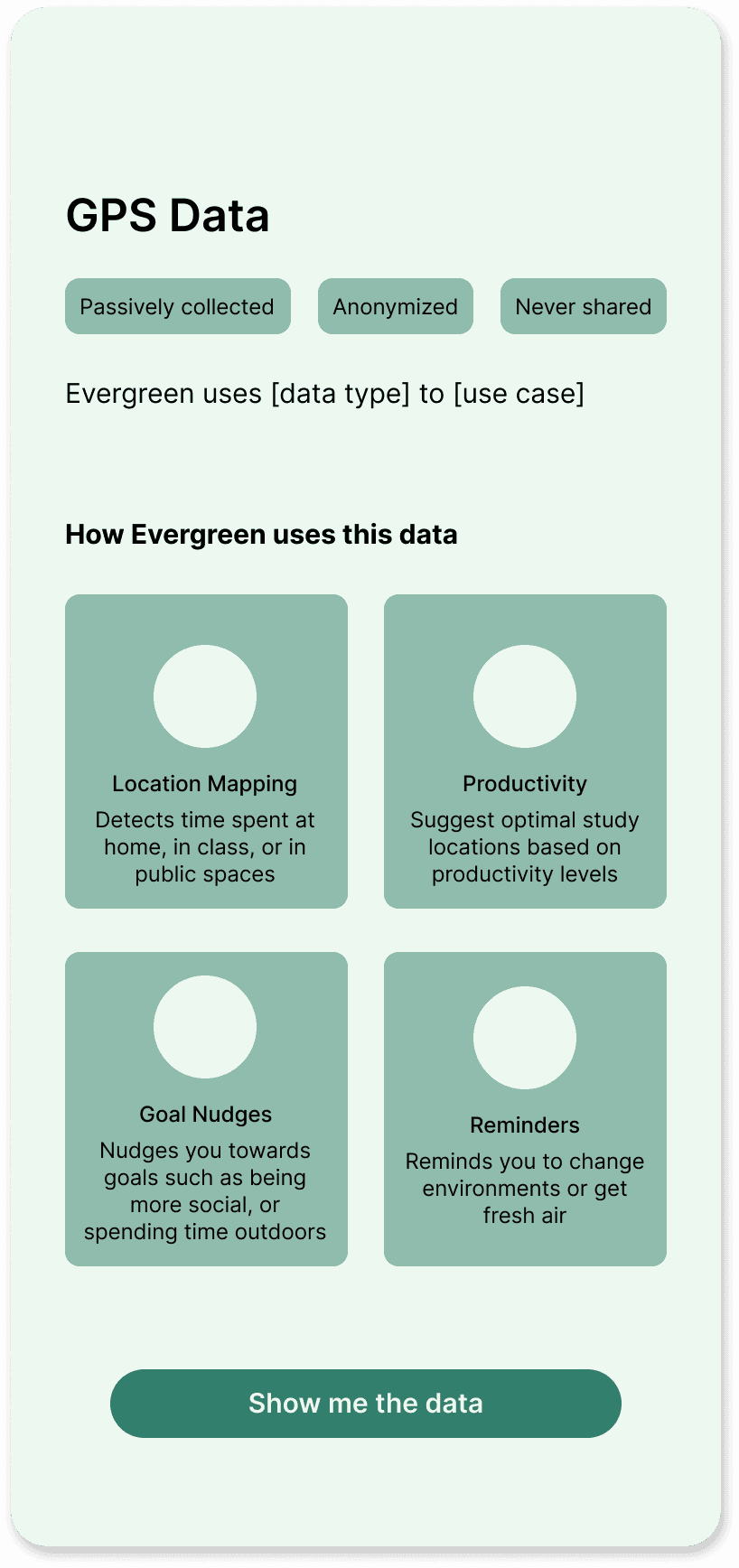
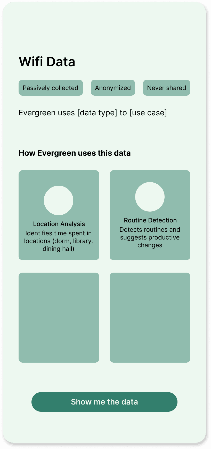
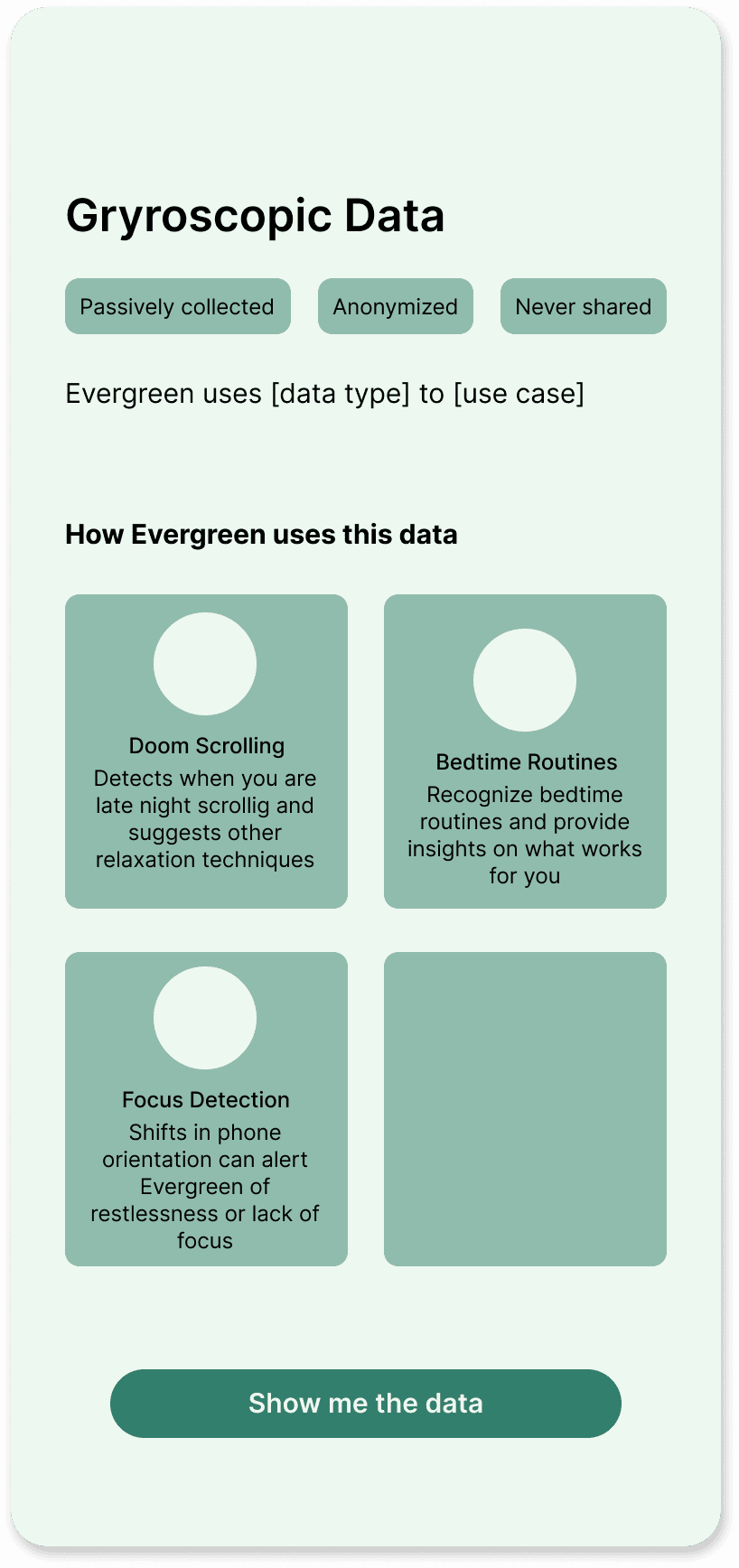
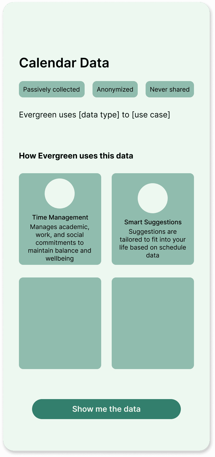
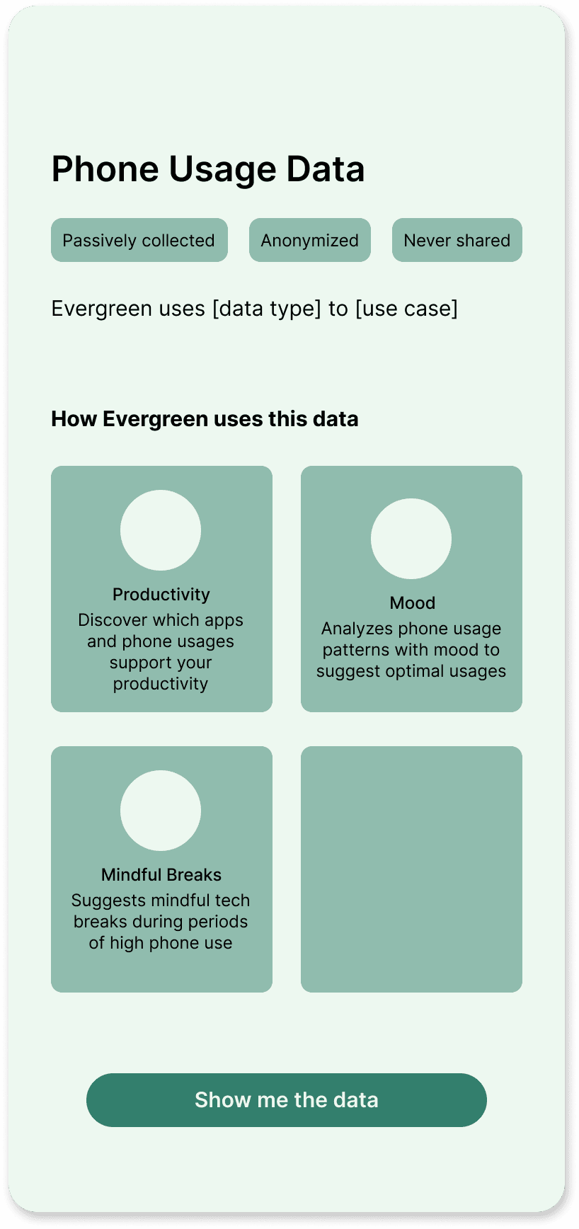
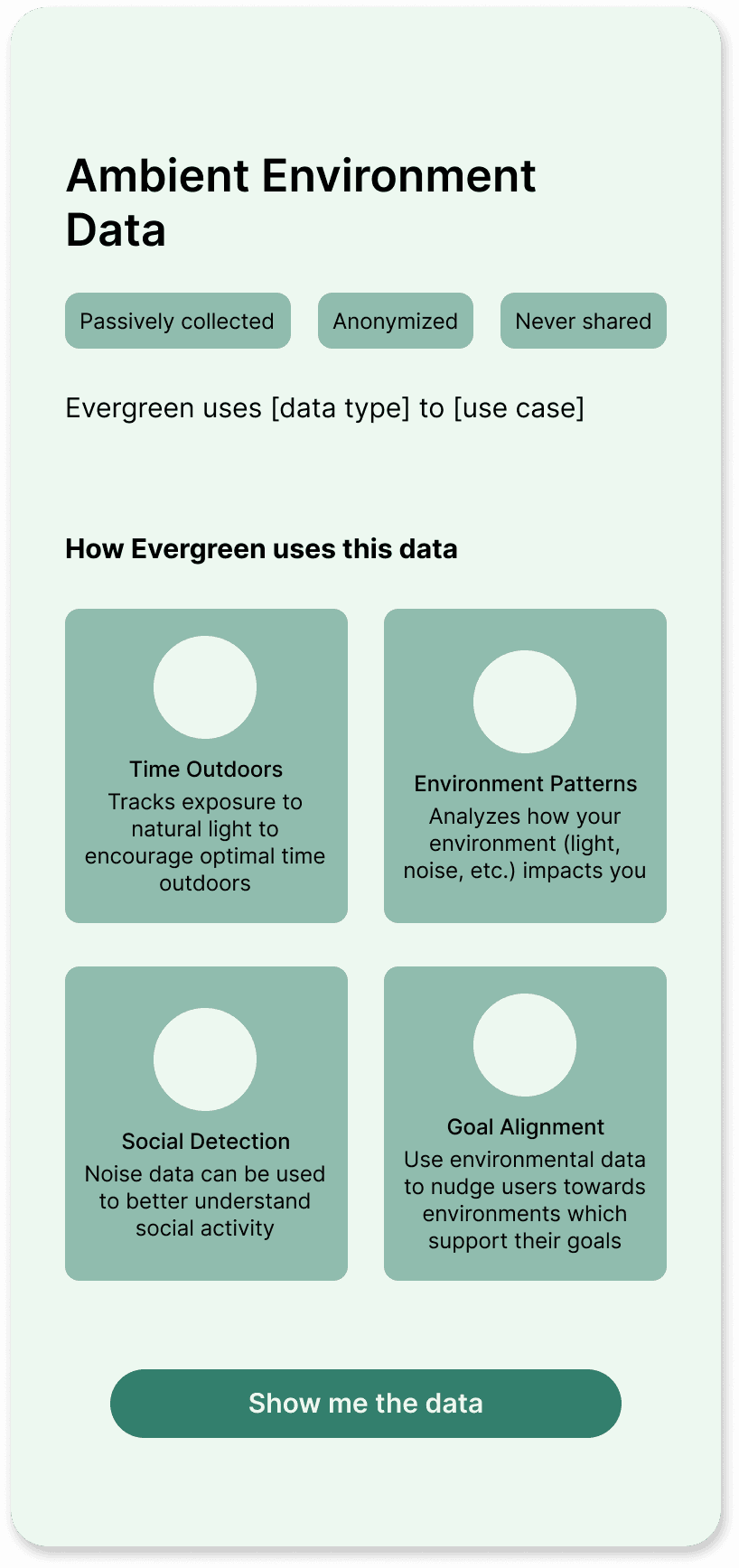
The partners liked the data-focused screens most. Thus, I kept the data-based organization. However, to satisfy the other insights from my research, I pulled in components of my other iterations and gave each data type its own page listing out the features it would be used for.
With the ambiguity of the project, I wasn’t fully sure what these features would be, so I used these screens as a brainstorming hub where I could hold ideas for possible features based on the data types we had.
Brainstorming feature ideas for data pages


Story-telling vs transparency tension
At the next partner meeting, tension emerged. One partner, who hadn’t been at the previous meeting, saw the onboarding flow and wanted to take a different approach.
As an experienced designer, this partner saw the onboarding as a chance to excite users. Other partners saw it as a way to transparently inform users about the product. The new partner pushed for a more story-based flow rather than the current, more data-driven flow.
Navigating tension through research and ideation
Having multiple voices of authority pulling in different directions made this decision difficult. I decided to follow the new partner’s suggestion given her experience in design, knowing that we could always revert to the old version if the other partners still didn’t like it.
Thus, I went back to the research and ideation phase. I turned to Mobbin to find inspiration for interactive, features-based onboarding flows.
Given the features-focused flow, I also took the initiative to lead a feature brainstorming session with the rest of the design team. I outlined four main categories of thriving: academic, social, physical, mental health and we started brainstorming features.
I led a feature ideation session to inform the new onboarding

A story telling approach to onboarding: personas
Drawing on the brainstorming session, I created different Dartmouth student personas. I showed ways that Evergreen could help these personas using the features we brainstormed.
I drew on my Mobbin research, emulating the one feature per page and graphic-heavy design style I saw in many screens.
One of the four personas I designed. Note: graphics are placeholders from flaticon

Having designed personas, and communicating use cases for Evergreen, I turned to designing the permissions page.
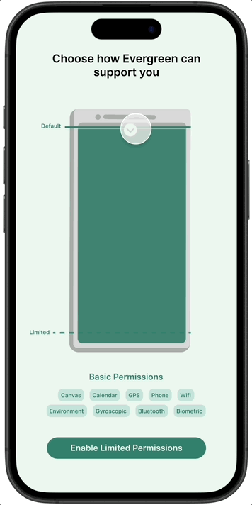
An interactive approach to privacy: data permissions slider
Based on discussion with partners, I created “tiers” for the permissions having different groupings (i.e., high, medium, low permissions) in order to reduce the mental load of having to decide which individual permissions to enable or disable, and thus pushing users towards higher permission settings.
During my research, I found an interactive slider in a Mobbin screen. I particularly liked this design and decided to use it as a “permissions meter.” I chose phone and battery-like imagery to communicate the idea that the more permissions allowed, the more “powered-up” Evergreen would be.
Interactive data permissions screen

Feedback and adjustments
Two tiers
During a team discussion, we worried that creating three tiers would lead users to default to the middle option. Thus, I changed the design to only incorporate two tiers and set the default to the high-permissions tier.
Language
I also changed the language around the permissions pages to focus on how Evergreen supported users rather than enabling permissions to develop trust.
Data pop ups
Next, I met with an external design mentor, to get more feedback on my designs. She pushed for a bit more of my original designs’ data-focus and transparency and suggested I combine the original data screens with the new phone interaction. I turned the original screen into a pop up that would overlay on top of the interactive battery screen when users clicked into each data type.
Version 2 permission screens

Old data screens

Version 3 permission screens
Note: Minor aesthetic adjustments were made to the final design to stay aligned with the other screens
The final use-case and permissions flow combined a features-focused, story-telling approach with a more transparent, data-driven permissions screen to create a flow that was both engaging and informative for new users.
CONCLUSIONS
This term, I adapted to a midterm pivot and designed the first full onboarding flow in five weeks, taking Evergreen from a mere concept, to a product with an informative and engaging onboarding flow. I turned the challenge of working on a big team into a strength as I blended everyone’s unique opinions together to create a strong, well-balanced product.
Some lessons from this project
Working on large teams
I learned how to handle differences in opinions by exploring many different directions, getting tons of different perspectives, and combining seemingly opposite ideas to create well-rounded designs.
Navigating ambiguity & adapting to pivots
As a first-term project, this project was full of ambiguity and pivots. I relied on expansive industry research for inspiration in this ambiguous project, and used rapid iteration to keep designs evolving in the face of ambiguity and pivots.
Thanks for reading :)
Back to cases