Habitat for Humanity
Role
Sole Designer
Date
Jan 2026
Project Timeline
3 weeks
Deliverables
Desktop & Mobile Prototype
Context
Habitat Women is a social enterprise program that connects 2 populations — women in need of work and housing providers in need of service. They train women in construction and then provide cost effective construction services to their housing partners.
Task
Improve the user experience of the Habitat Women site and drive engagement.
Results
Time to get to "request a quote" form reduced by 78%
Navigation between pages on desktop 2x faster
Mobile page word count down 46%
Conversion rate, bounce rate, and site traffic metrics will be updated once site is live
The Problem
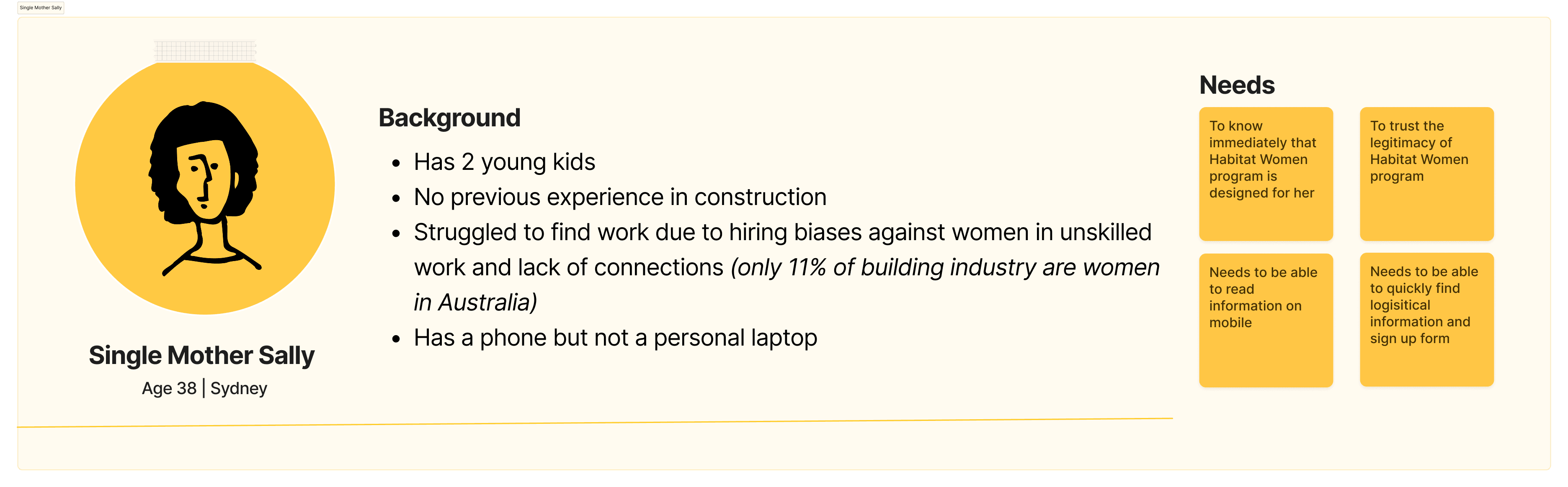
Habitat Women serves two distinct users: trainees and housing providers
Without direct access to users, I created personas distilled from conversations with staff who worked closely with Habitat Women trainees and a Habitat housing partner (& additional research).
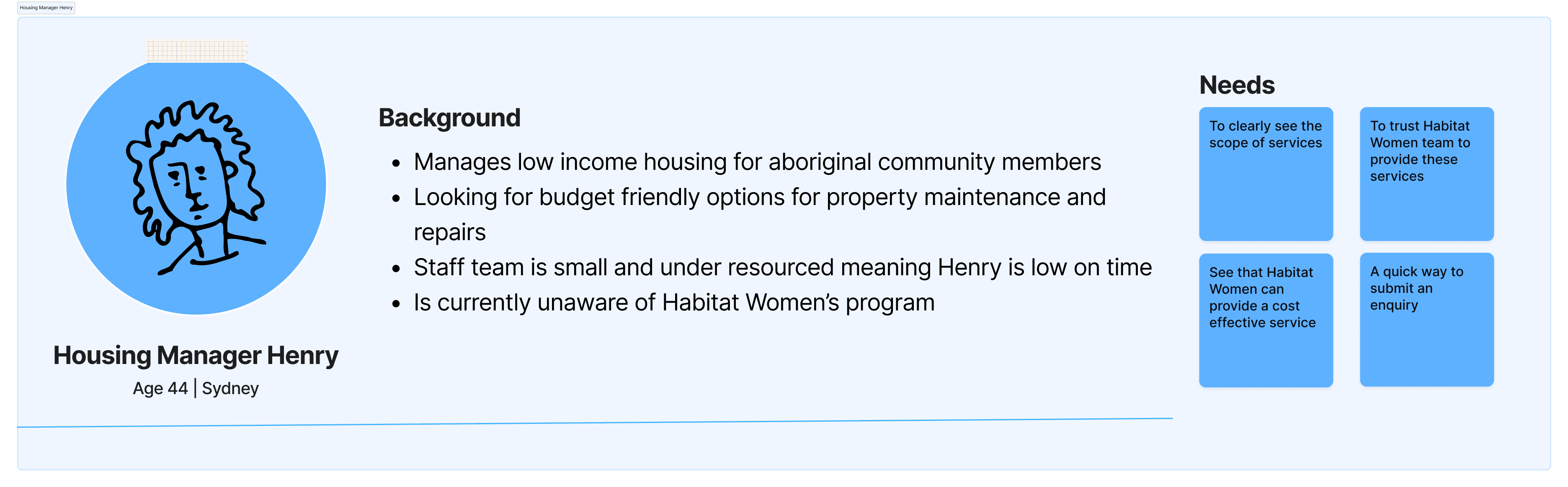
The current site isn't designed for housing providers, which creates more outreach work for staff
I conducted a site audit via my two personas and found that the site isn't designed for housing providers. I then confirmed my hypotheses via user testing. Because housing providers are not engaging with the site, staff have to compensate through manual outreach work.
58 seconds for user to find request a quote form
Further, the site is an overwhelming mobile experience for trainees
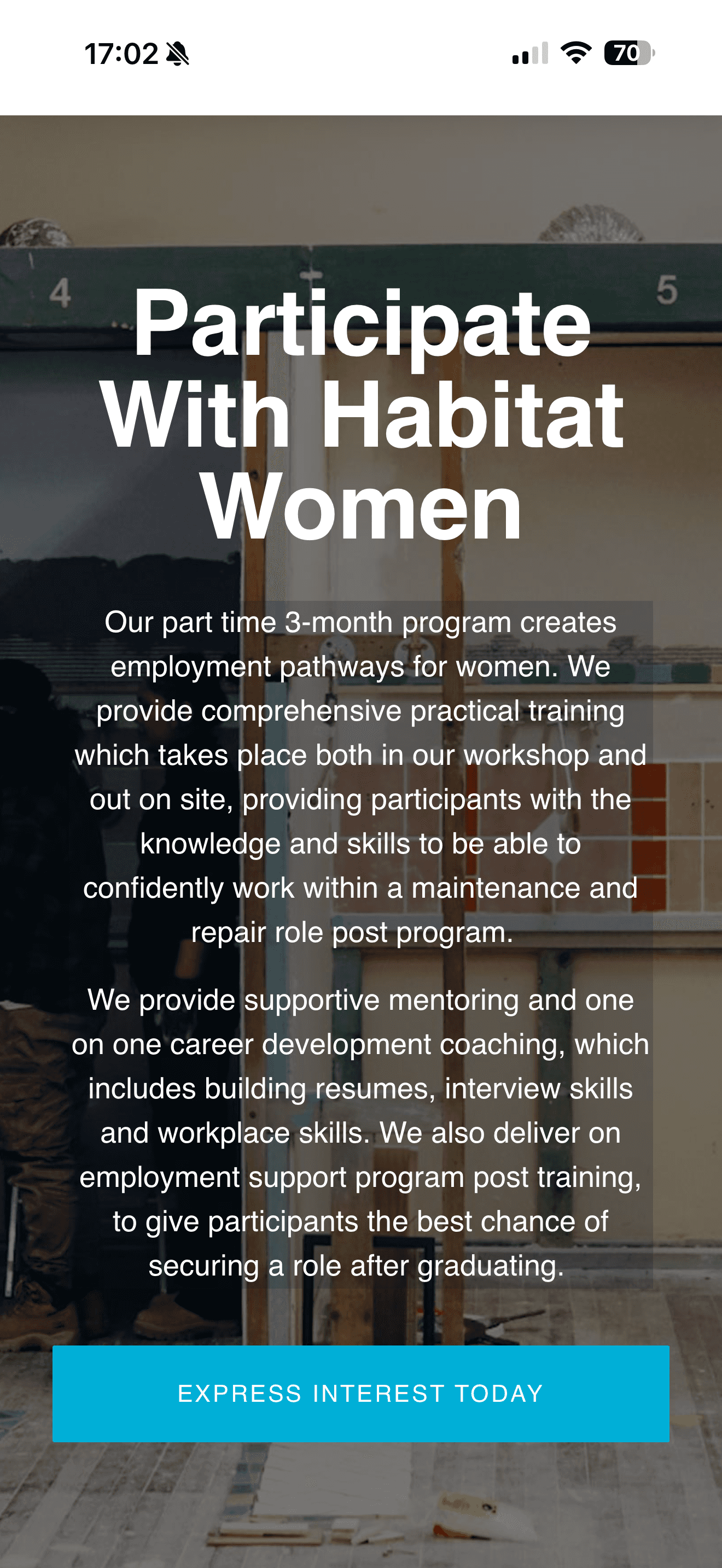
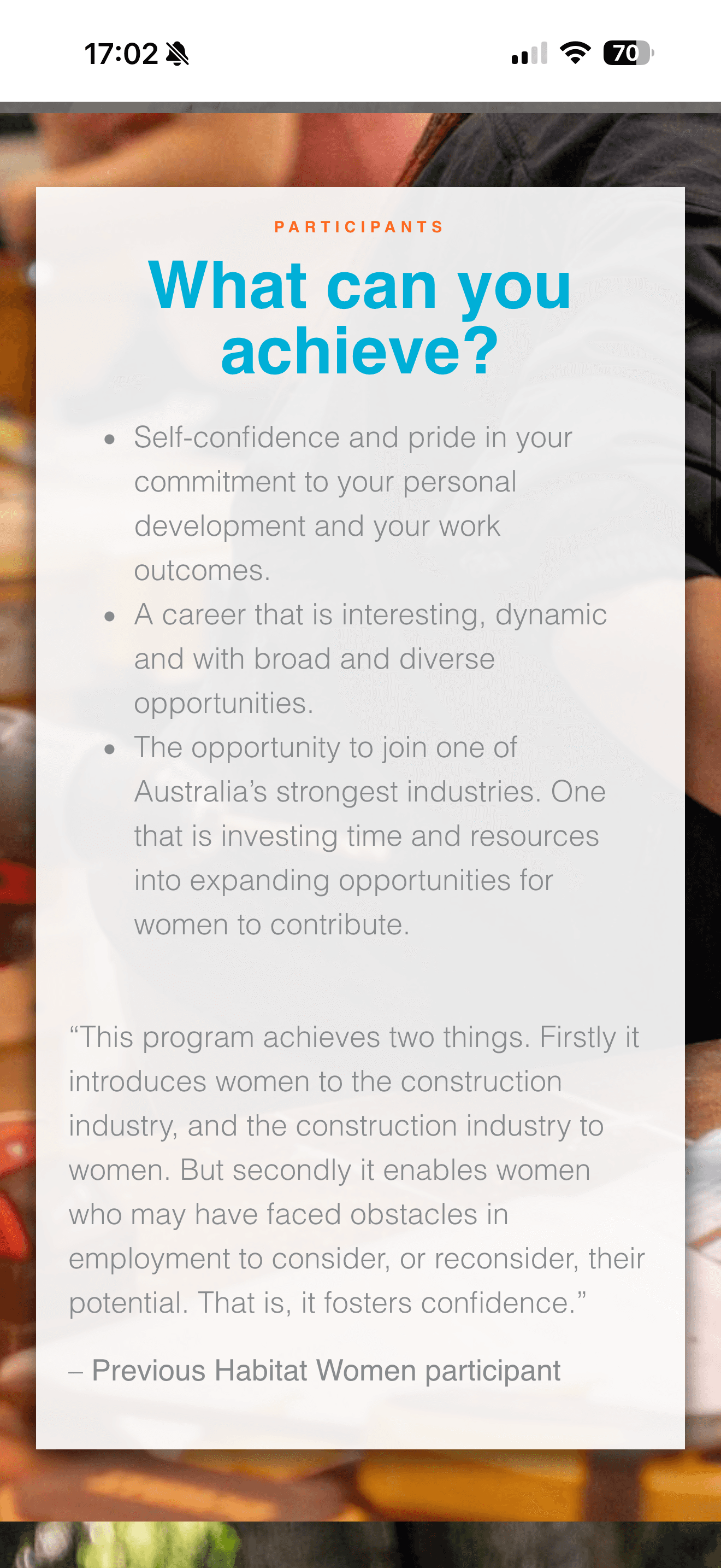
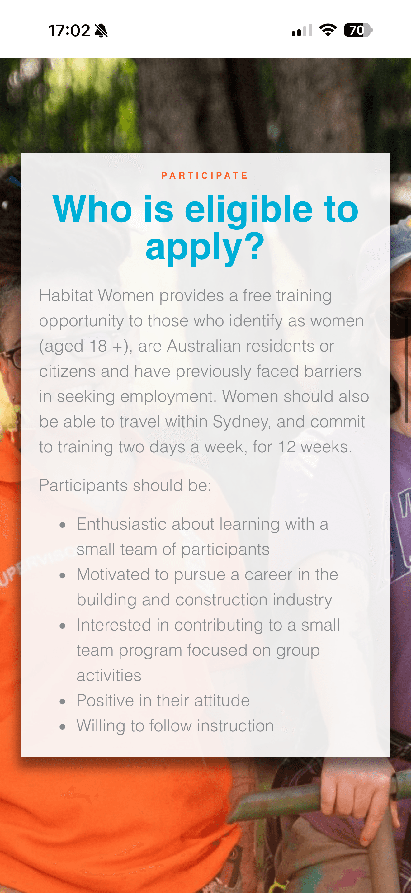
Habitat Women's main target audience is mobile-based, busy population with a range of education levels. Text-heavy pages full of jargon make it hard to skim through.
The Solution
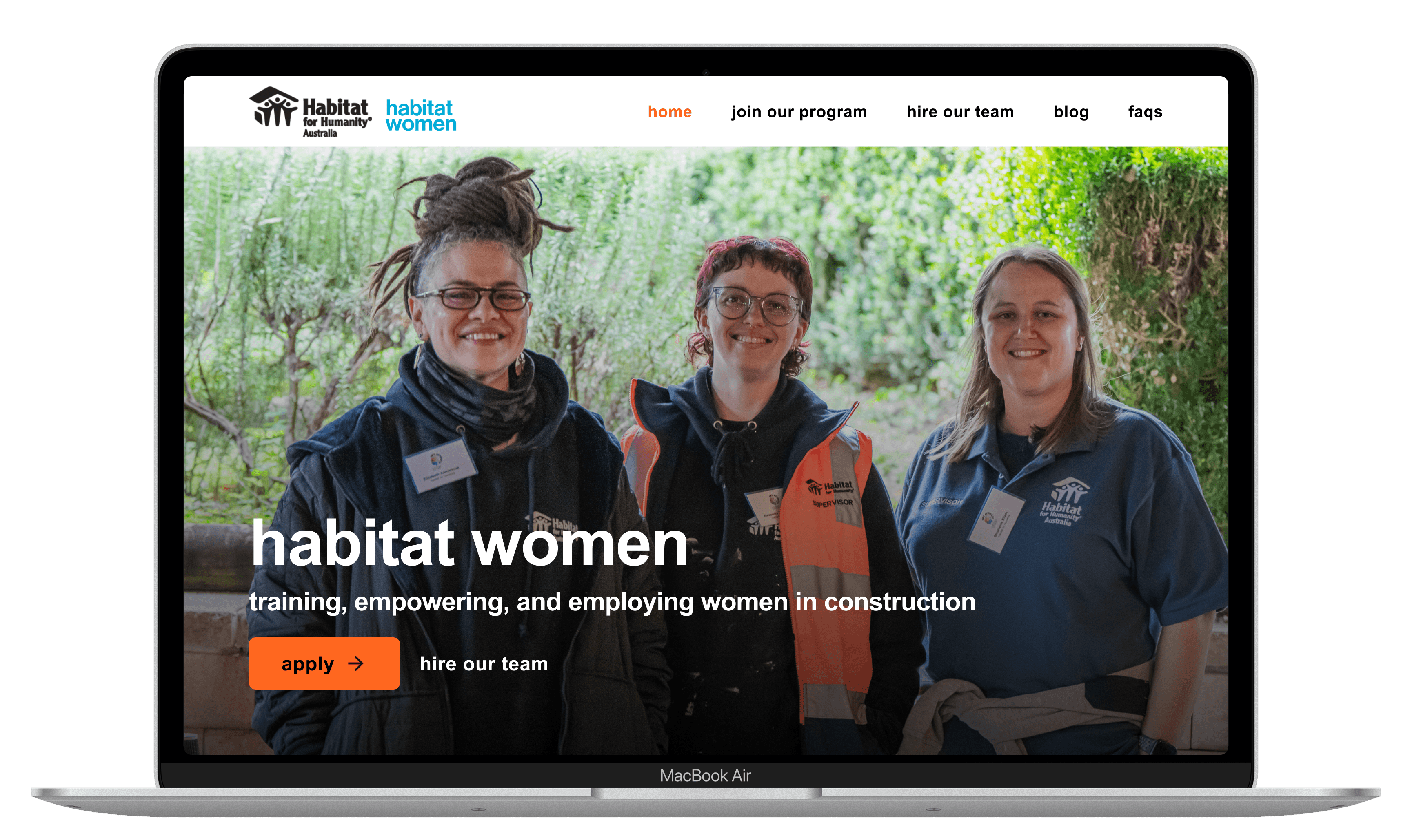
The Home Page
Time to find "request a quote" form reduced by 78%
I used primary and secondary calls-to-action and 2 column layouts to speak to both audiences. This created a site that felt applicable to both user groups and allowed housing providers to easily navigate to their form without compromising the accessibility for prospective trainees.
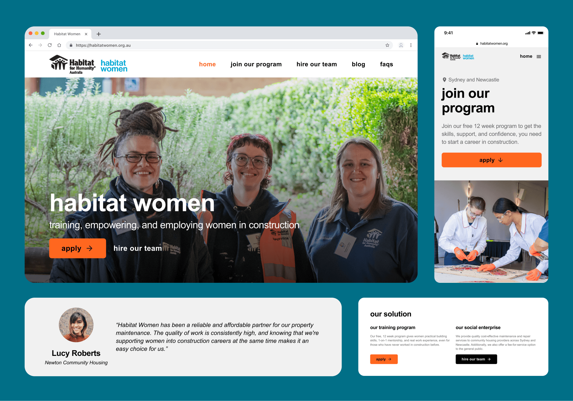
13 seconds to find form on new site (45 seconds faster than old site)
New design speeds up desktop navigation by 2x
I replaced the hamburger menu with top bar navigation for desktop users. Additionally, I redesigned the site architecture to consolidate sections for maximum clarity and efficiency. Changes in microcopy were also user tested for highest clarity.
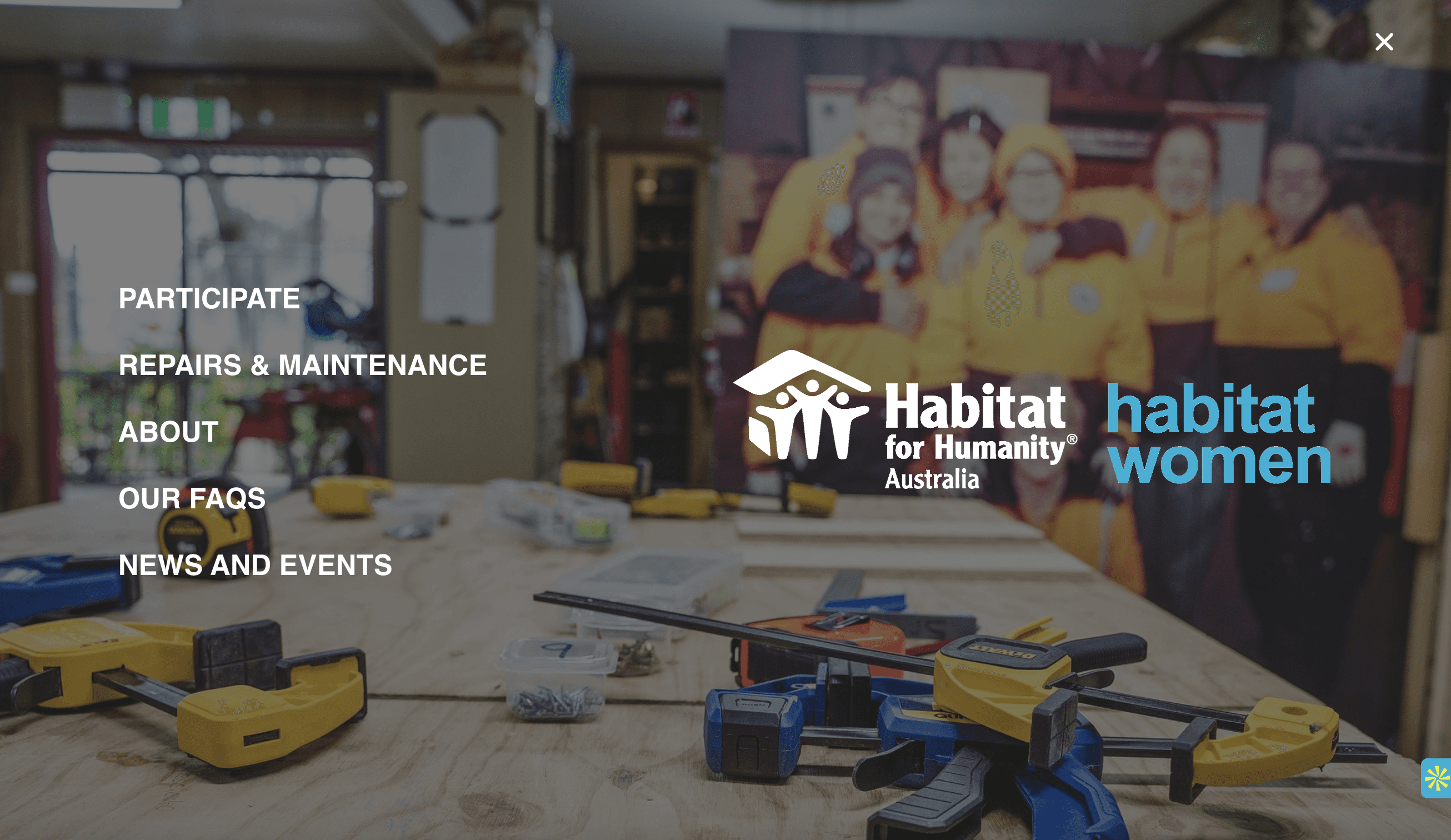
Old hamburger style menu

New top bar navigation
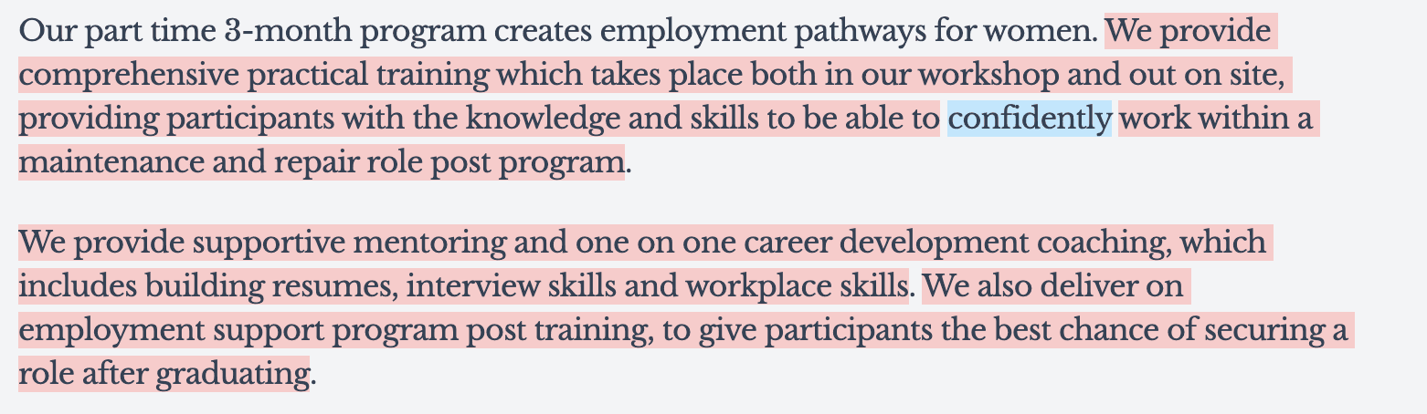
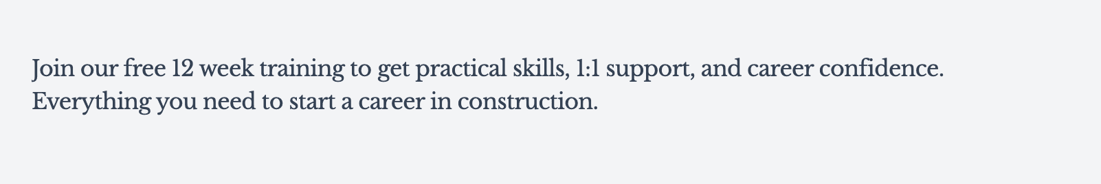
New copy lowers reading-level and reduces word count by 46%
I rewrote copy to be more accessible to users, using Hemingway to measure readability.
Before
After
Mobile
Desktop
I designed the trainee page on mobile first to prioritize the true user experience
Conclusions
What I learned
This was my first project experimenting with incorporating AI into my workflow. Though I still had a lot to learn, I found Lovable helpful in visualizing new designs and layouts to push me out of my default style—this was especially useful as I was designing with a style guide that was different from my personal design style. I found Claude helpful in reasoning through design choices from the perspective of my personas in the absence of user testing with the direct population as well as helping me iterate on copy.
What I would do differently
In the absence of user interviews and user testing with the target population and site analytics, much of my problem discovery was based on secondary information and speculation. On future projects, I would advocate more strongly for access to the target population or access to site analytics.
Volunteer Day at Rainbow Lodge
02/19/2026
Thank you!
A huge shoutout to my mentor Monique Crusius, the Habitat for Humanity Australia team, and Dartmouth College for this incredible learning experience. I truly enjoyed my time in Sydney and am grateful to have worked with such a lovely team :)
Thanks for reading :)
Back to cases