My main focus was the episodes page. I combined two types of episodes into an easy-to-navigate drill-down view so users could quickly find and play episodes.
The current state
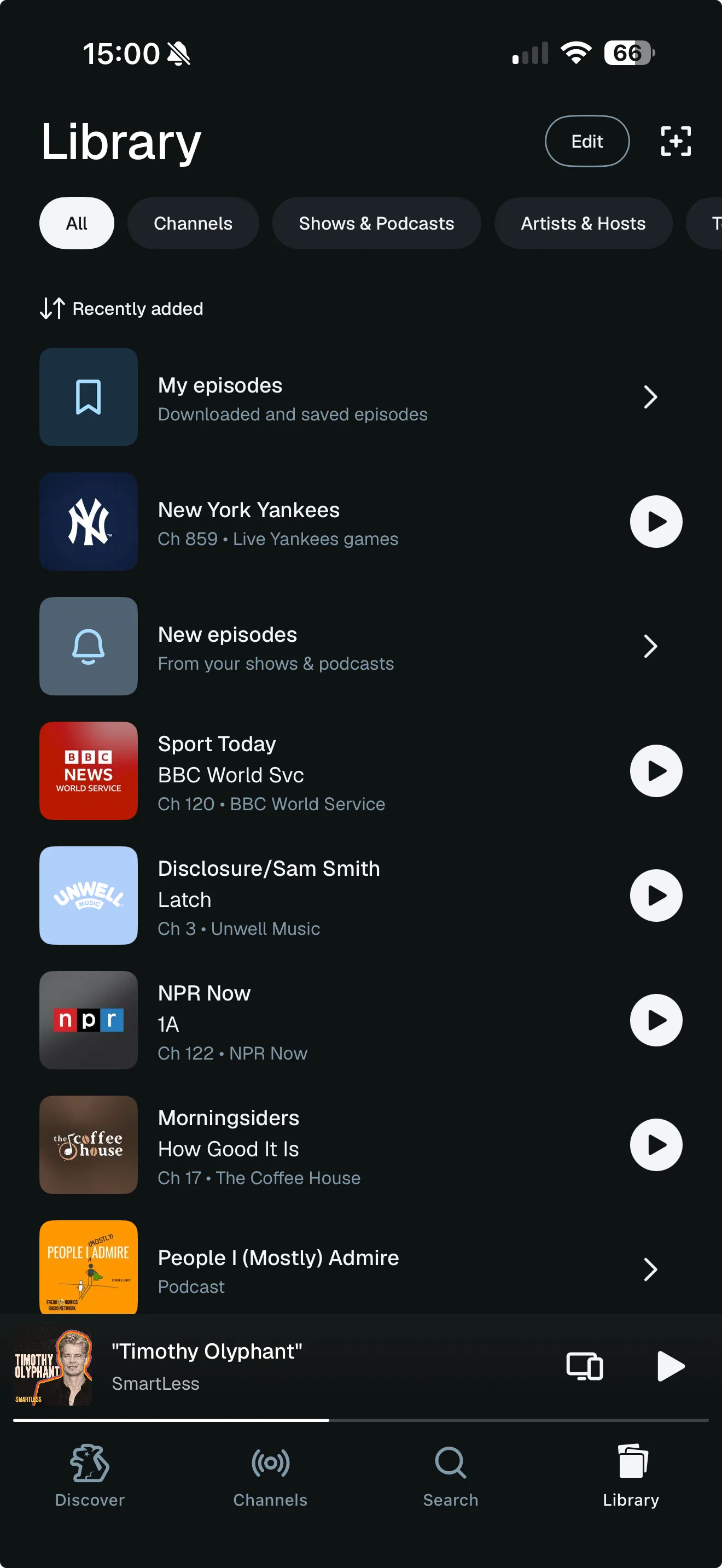
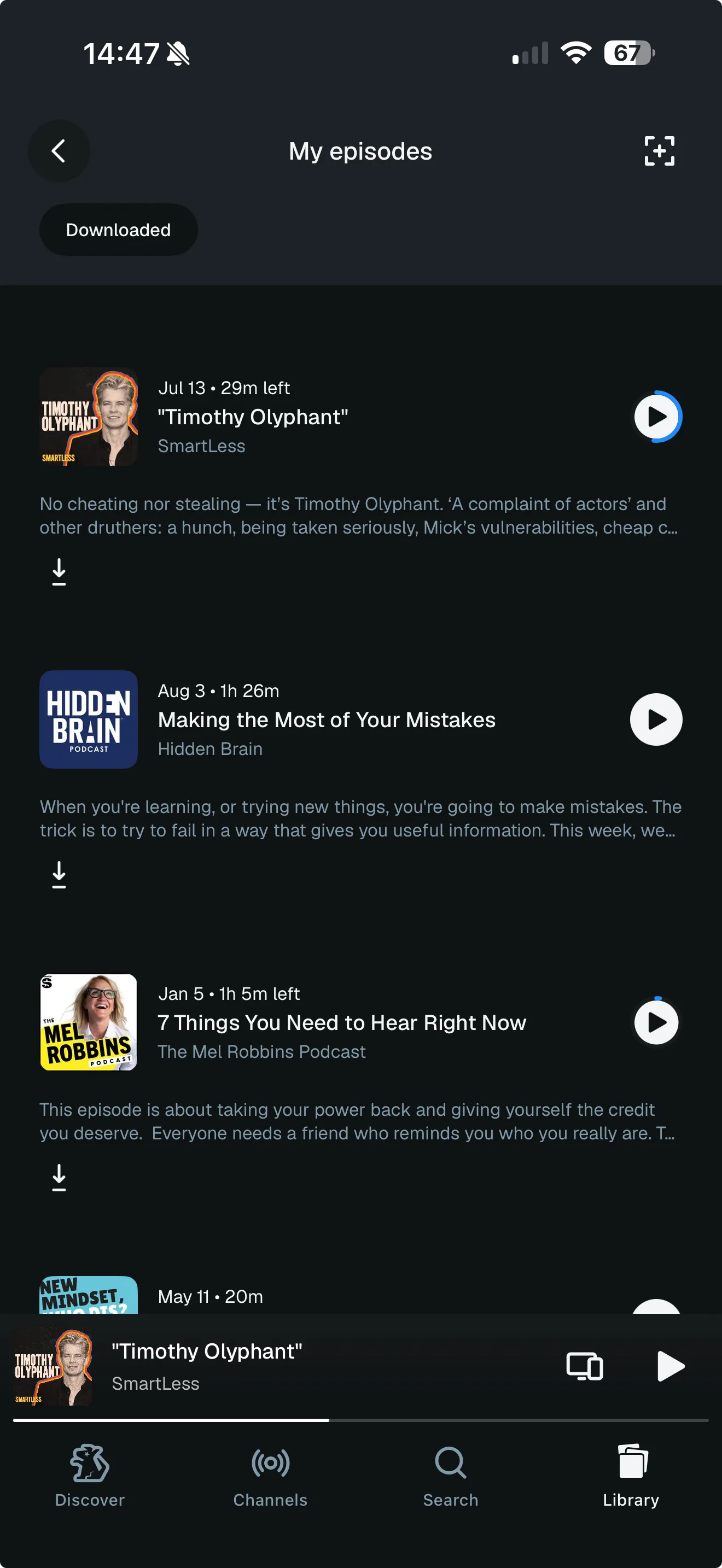
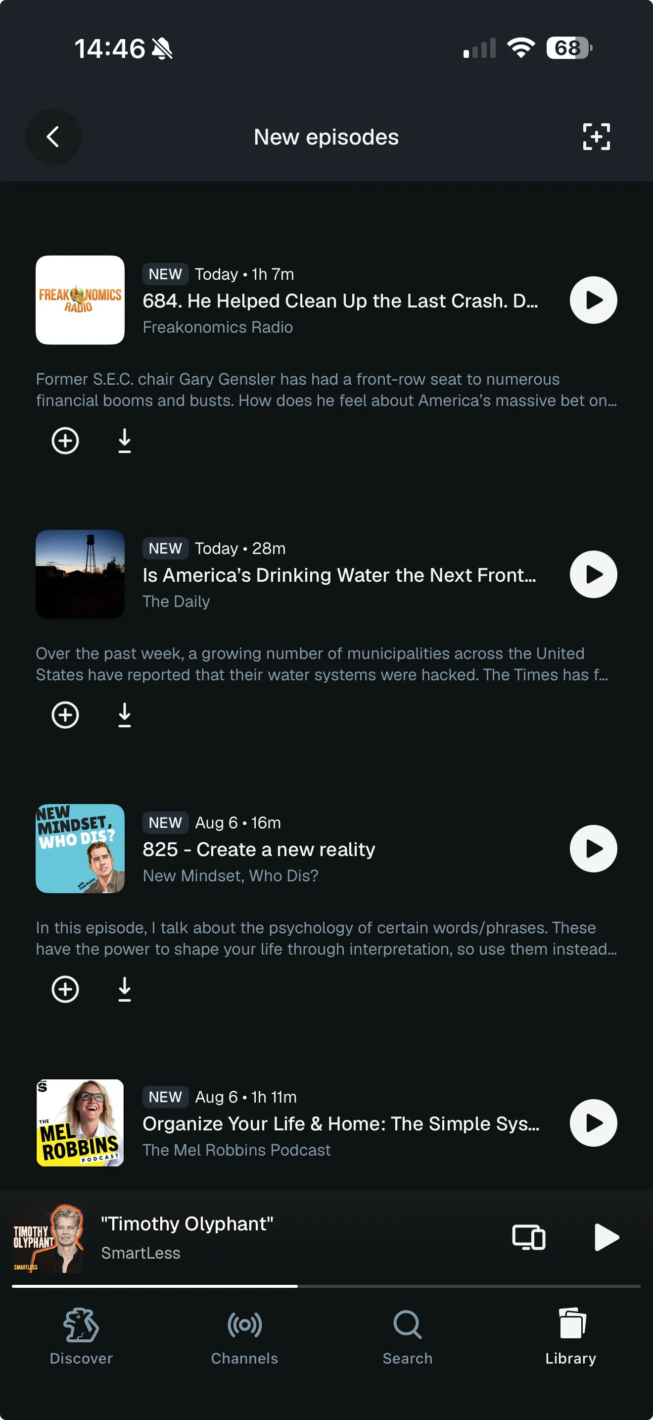
Episodes didn’t have their own dedicated page. Instead they were organized in two folders in the library. Hiding content behind folders and separating two different types of content (saved vs new) led to fewer users regularly using episodes.
The process
This case is organized into the four main decisions I drove during the design process.
Advocating for action buttons
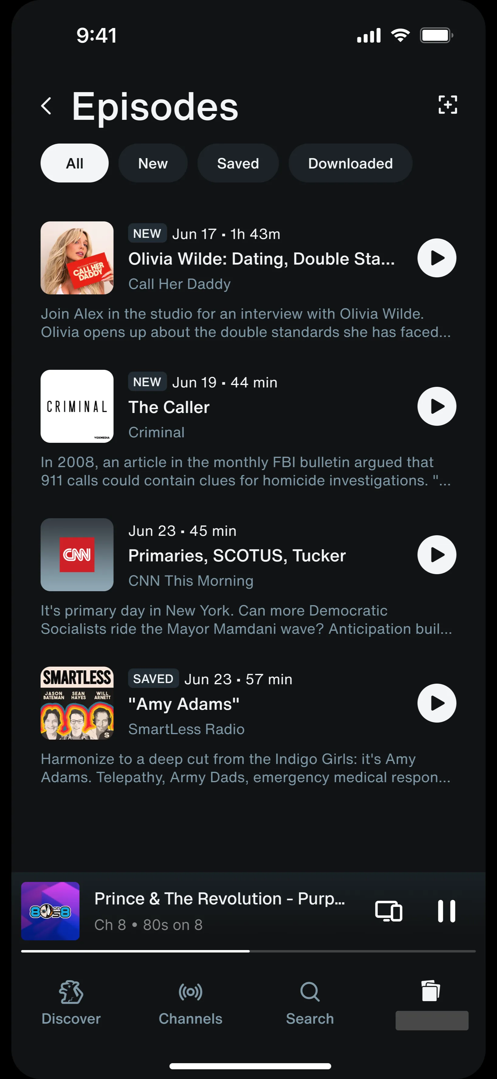
The original product brief wanted to remove action buttons (save and download) to promote the long press, which could hold more actions.
I argued that removing them didn’t just take away the only call to action to save or download episodes. It also made it impossible for users to tell which items weren’t saved or downloaded yet.
Replacing meaningless filters with actionable ones
The My SiriusXM Episodes page merges My episodes and New episodes. Thus, it made sense to think about how these two types of content should be differentiated in the new Episodes page. I began my process exploring different ways to break up the New and Saved episodes, but quickly found problems with this divide.
- New as a category and new as a badge meant different things, creating inconsistent labelling. The new badge appears on episodes released in the last 48 hours, but “new” (in the New episodes sense) refers to the most recent episode of podcasts you follow, which might be a week old. So a “new” filter would hold some items badged “new” and others that weren’t.
- The median user follows one show, meaning they’d have a maximum of one “new” episode. That makes the “new” filter unnecessary for most users.
- “New” and “saved” are arbitrary backend distinctions. To a user, everything in the drill-down is an episode they care about — whether they saved that episode themselves or it came from a show they follow. Forcing them to choose between the two is unnecessary.
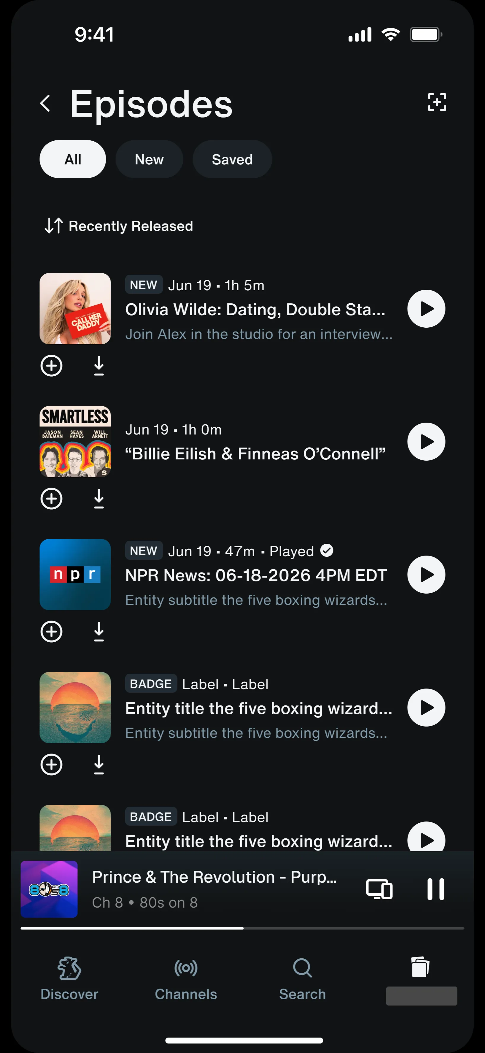
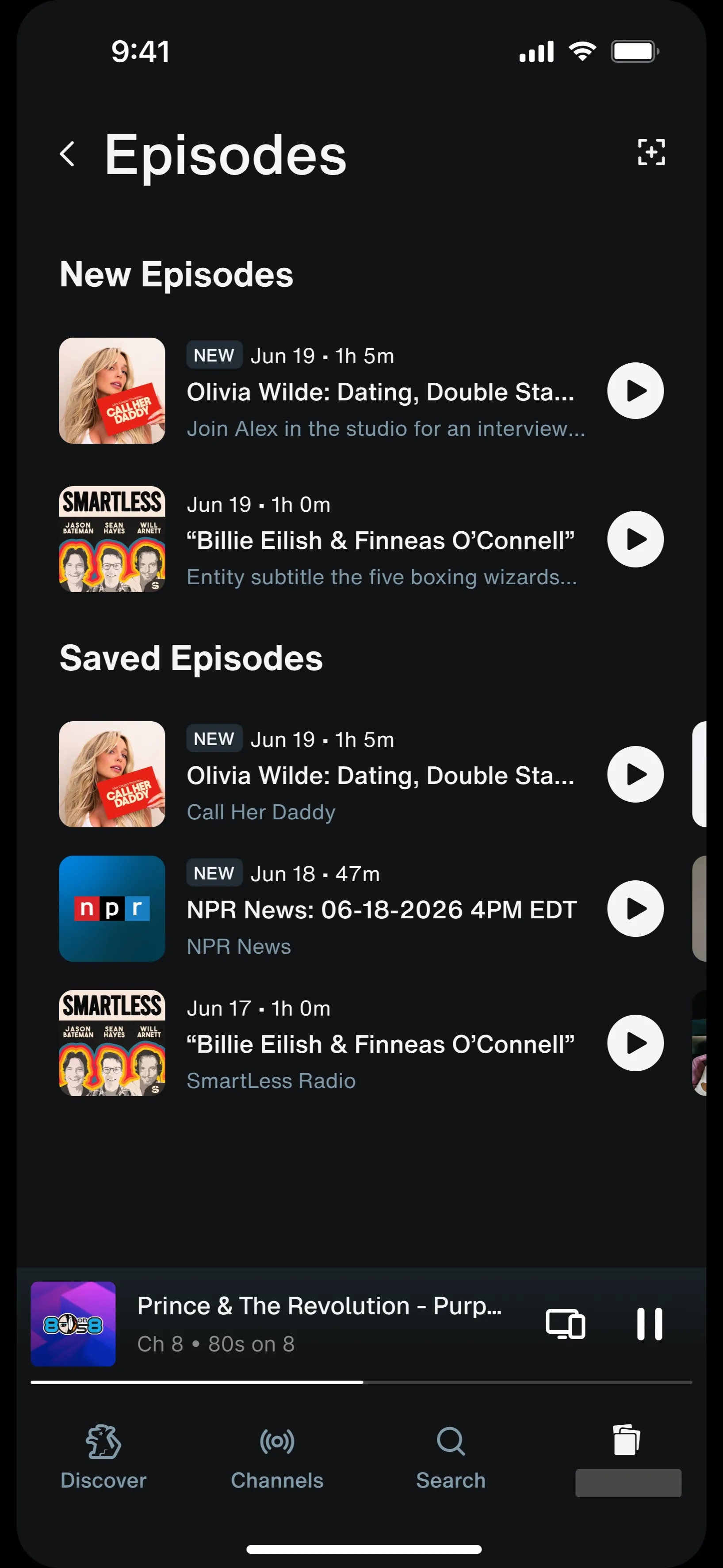
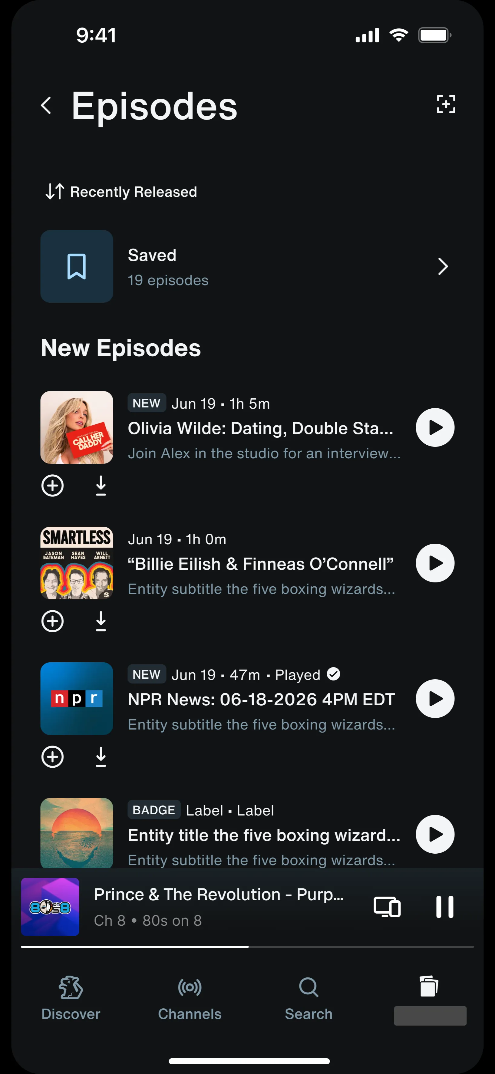
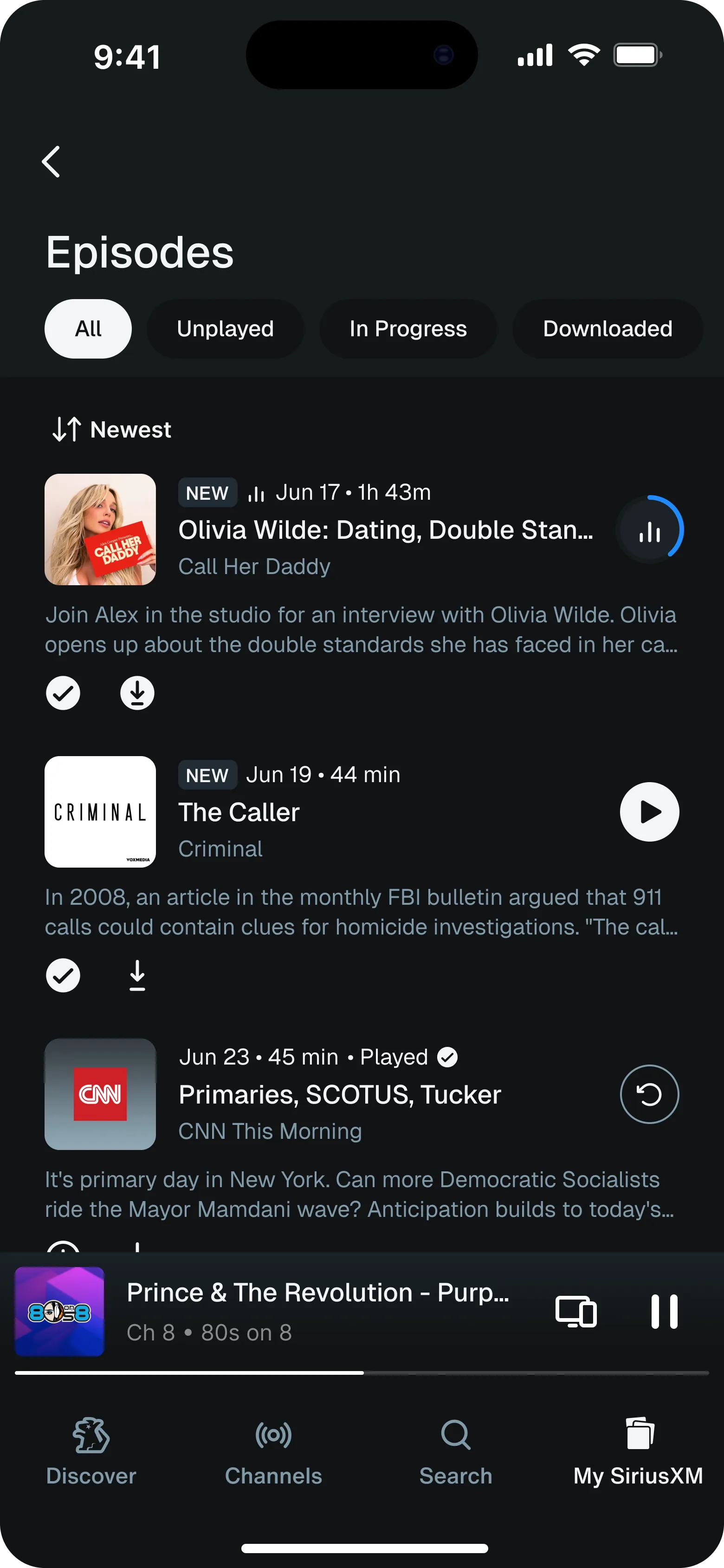
Instead of forcing this distinction on users and causing confusion between different types of “new,” I advocated for status-based filters (unplayed, in progress, downloaded), since users could act on those.
Developing a new filter framework
The brief originally proposed disappearing filters for both the Favorites and Episodes pages. I proposed a new framework for filter behaviour depending on whether a filter is status-based or categorical.
-
Categorical filters should change depending on content.
- The point of categorical filters is to browse a collection more efficiently; scrolling past empty filters defeats the purpose.
- The empty state doesn’t provide meaningful information.
-
Status filters should be persistent.
- Status filters orient you, so the empty state carries information.
- E.g. no unplayed episodes left → you started all the episodes you wanted to listen to.
- Status changes far more often, and a filter set that is always changing feels unstable.
- Status filters orient you, so the empty state carries information.
Based on this logic, I successfully argued that Favorites filter pills (categorical) should adapt to the content while Episodes pills (status-based) should stay consistent.
I adapted designs across 4 breakpoints
One pattern that broke across the breakpoints was the infinite scroll pattern. On mobile, tablet, and web, the favorites and episodes sections were infinite scrolls, with a view all button in the section header. However, the design system didn’t support a view all button in the header for TV. Instead, TVs used a “view all” tile placed in the final slot. However, placing the “view all” tile at the end of an infinite scroll made the “view all” mostly redundant.
We briefly considered not having a drill-down page at all in TV and having the page navigate via the infinite scroll, but this took away users’ ability to filter content. Thus, I decided to not incorporate infinite scroll in TV breakpoints, and instead cut the scroll off and put a “view all” button in the last slot.
The final design
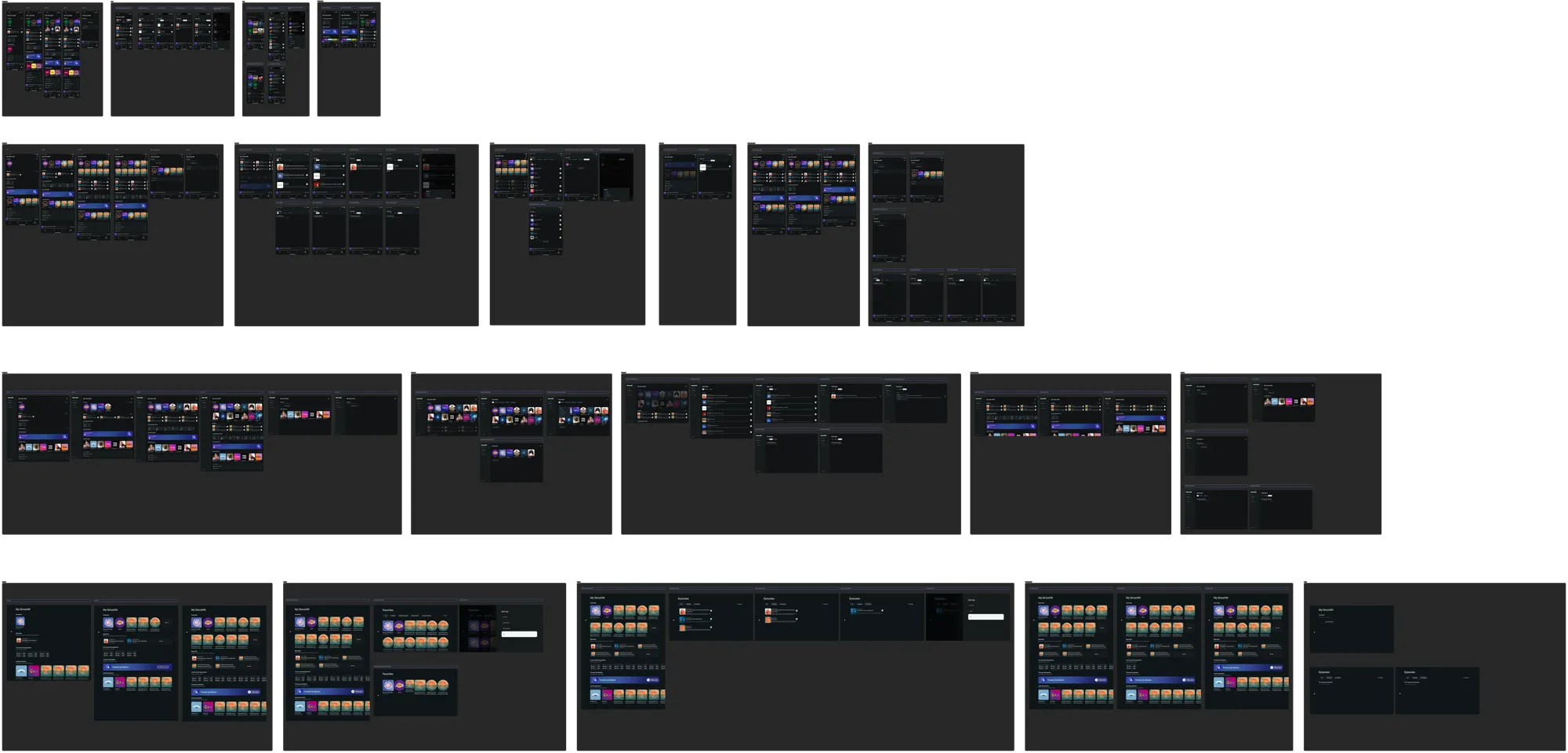
In total I designed the Episodes, Favorites, and Downloads drill down pages, the Live & Upcoming games section, and all empty states across 4 breakpoints
Reflections
What I learned
This project was an incredible learning opportunity and huge thank you to the working team, my mentors Joshua Claassen and Michelle Hsu, and the design systems engineers for helping me navigate everything! Two of my key takeaways were:
How to design consistently across multiple breakpoints
This was my first time designing in a formal design system. Adapting a page across multiple breakpoints meant rethinking the flow in the context of the new device, not just scaling the design. When components or design patterns didn’t translate, I worked with the design systems team on what was feasible.
When to challenge requirements
This was also my first time designing against formal product requirements. Asking why each one was written taught me the reasoning underneath: the design system’s constraints, the business goals, and the research behind them. It also surfaced the ones whose rationale had gone stale. I challenged requirements like the disappearing episode filters as the design evolved.
I have been consistently impressed with how quickly Ellie has picked up context to the My SiriusXM project and has made really intelligent suggestions for design solutions that the team seemed eager to take. I think that she is such a well-rounded designer in that she has sharpened and employed several skills to make the best design decisions possible.
 Kelsey WortUX Researcher
Her work on Utility Group 3 was especially impressive: it's a robust, detail-heavy project, and she tackled it thoughtfully, piece by piece. She considered the full user experience — from primary use cases to edge cases — and her thoroughness was critical in advancing both the product and design requirements. I have a great deal of confidence that, when we hand Group 3 off to engineering, there will be few if any open questions because of the clarity and care she brought to the work.
 Madeleine WrightProduct Manager
On the Utility team we were moving quickly, trying to complete Group 3 designs. In one day, she created mid-fi designs for several primary page screens and empty states. She is excellent at moving quickly and creatively and she is great at making sure logic makes sense and is clearly documented.
 Jubilee JohnsonContent Designer
What’s next
- Measure playback starts after launch and compare against the current library’s 27% of playbacks.
- Measure whether there is an increase in Time Spent Listening (TSL) per session and per user compared to the current Library’s 20%.