I designed transparent data permission screens to clarify Evergreen’s use of passive sensing data and build student trust.
The Challenge
To conceptualize and design the Evergreen app & onboarding
This case study focuses on the data permissions screens. Evergreen’s value depends on passive sensor data — it needs as much data as possible to give accurate recommendations. However, students were already wary of giving data to the college. The challenge was to build student trust through this onboarding flow, specifically at the permissions page.
The Process
Industry Research
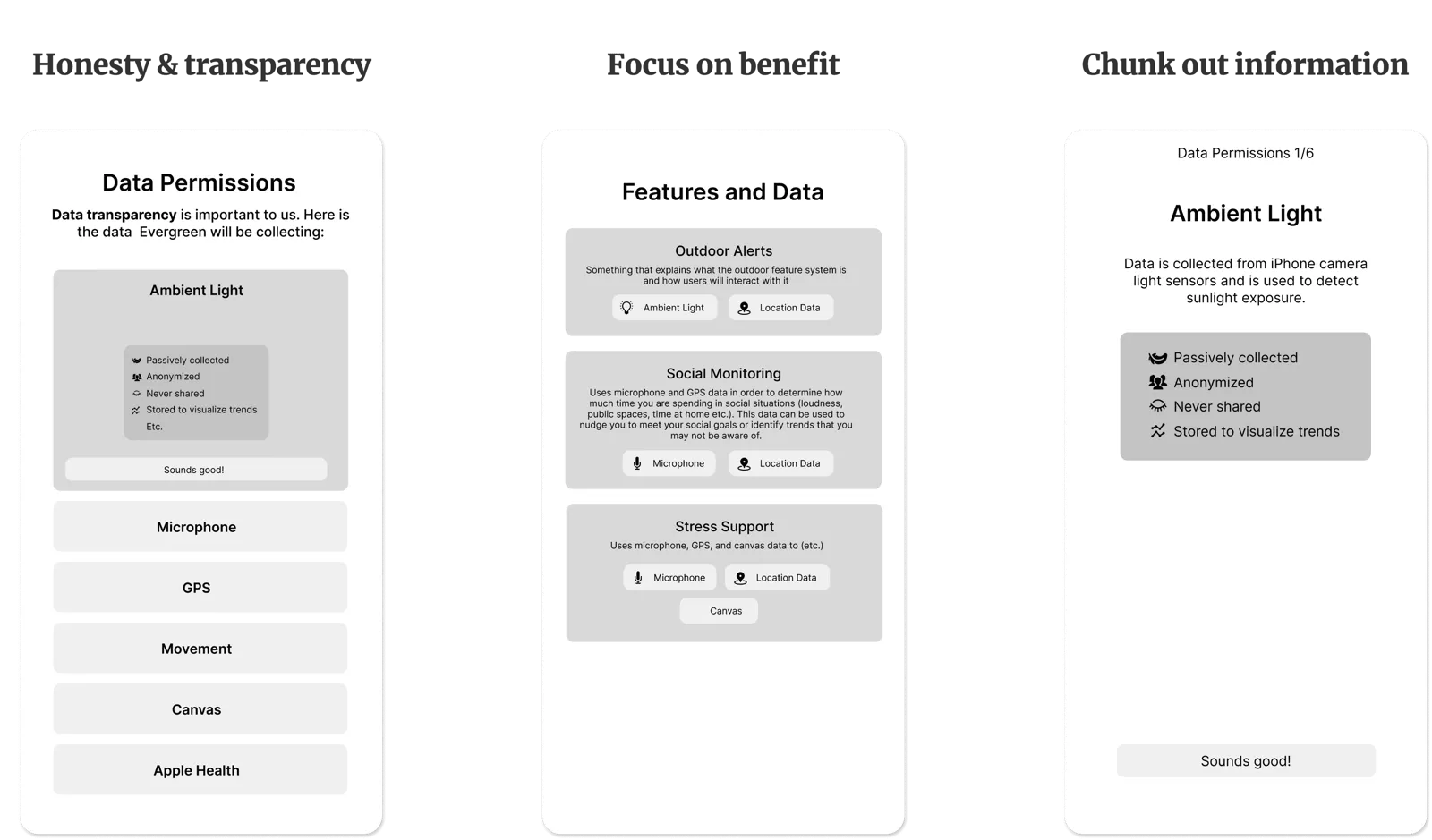
I researched data-sensitive privacy pages and found 3 key themes
Honesty & transparency
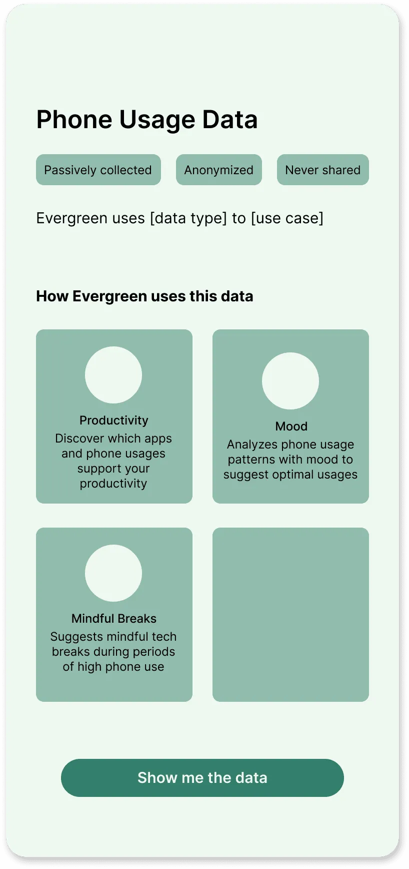
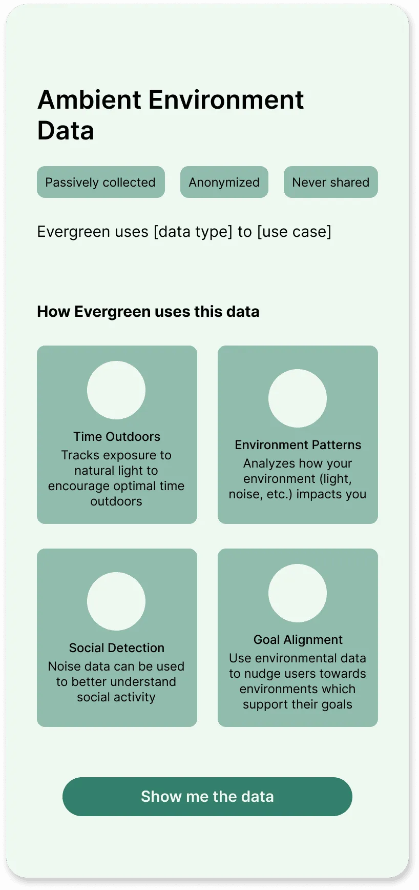
The permissions were organized by data type and included as many details as possible about its use.
Focus on benefit
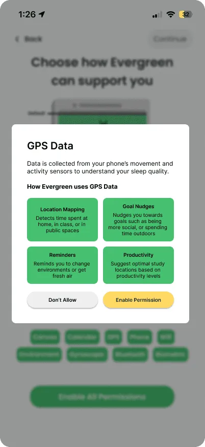
The permissions were organized by feature to focus on the benefit to the user.
Chunked out information
The permissions were shown one at a time to avoid overwhelm.
Researched iterations
Combining screens based on research
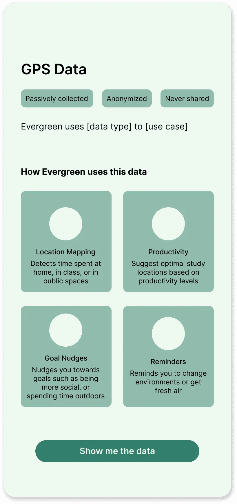
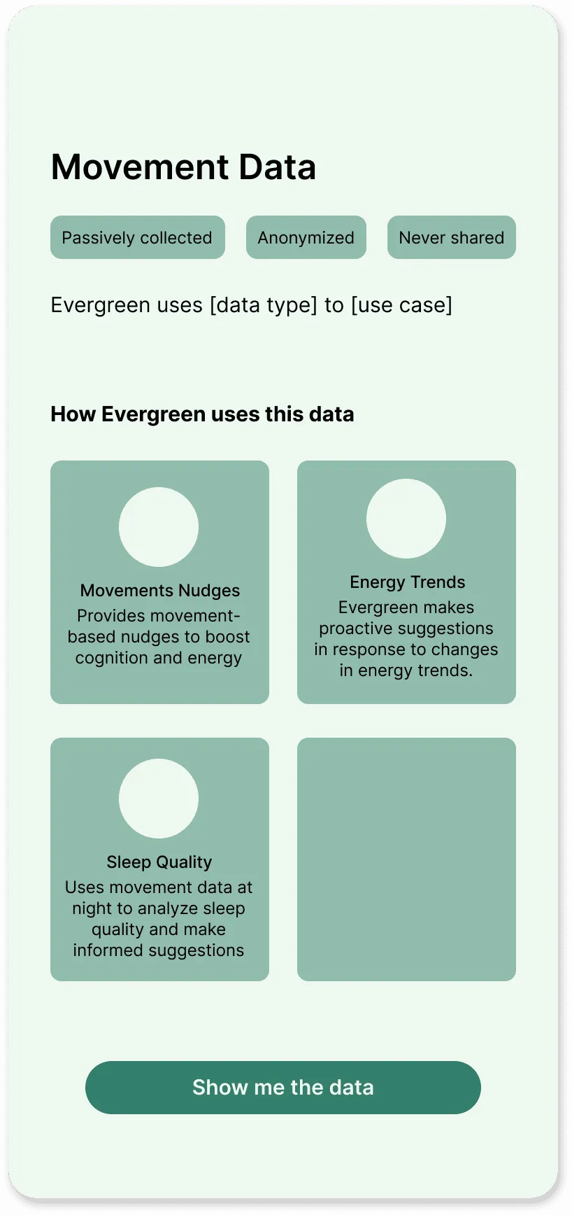
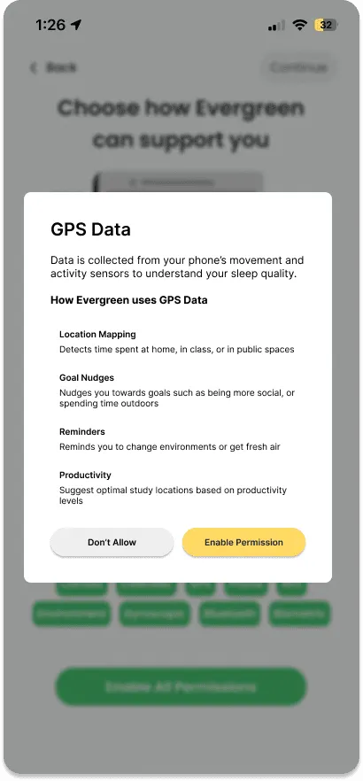
The partners liked organizing the permissions by data type (“Honesty & transparency” screens). I based my designs on that version and continued to iterate so the benefit to users was clear and information was chunked out as well. The project’s scope was still undefined at this point, so alongside designing the permissions pages themselves, I used these screens to explore what features Evergreen might actually need.
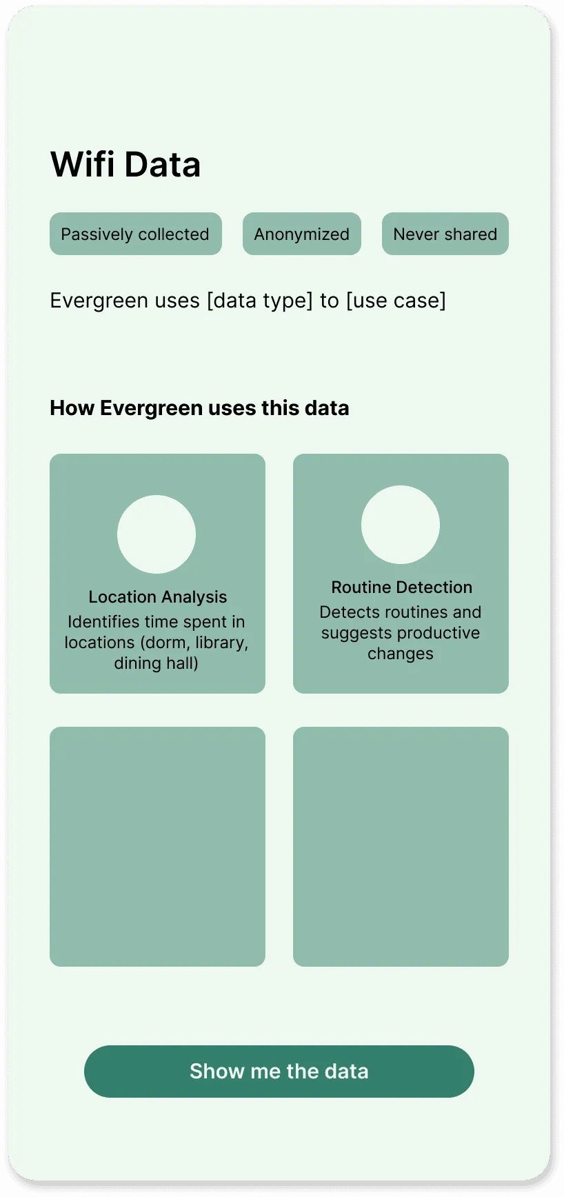
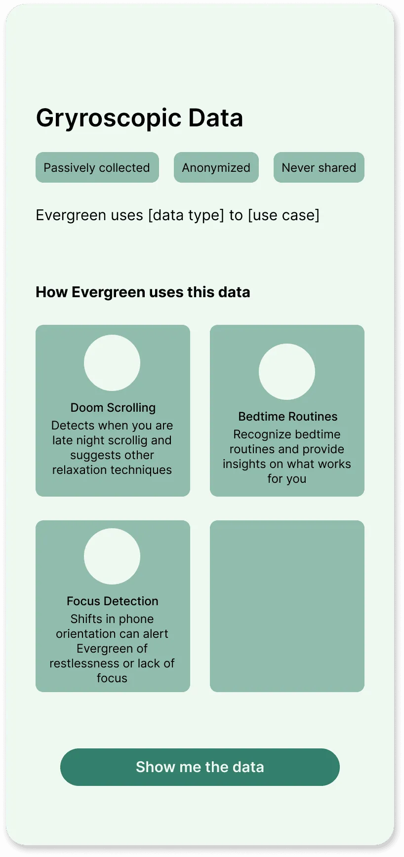
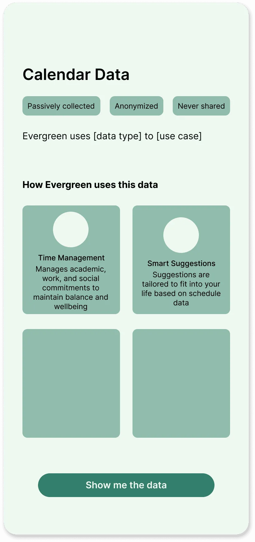
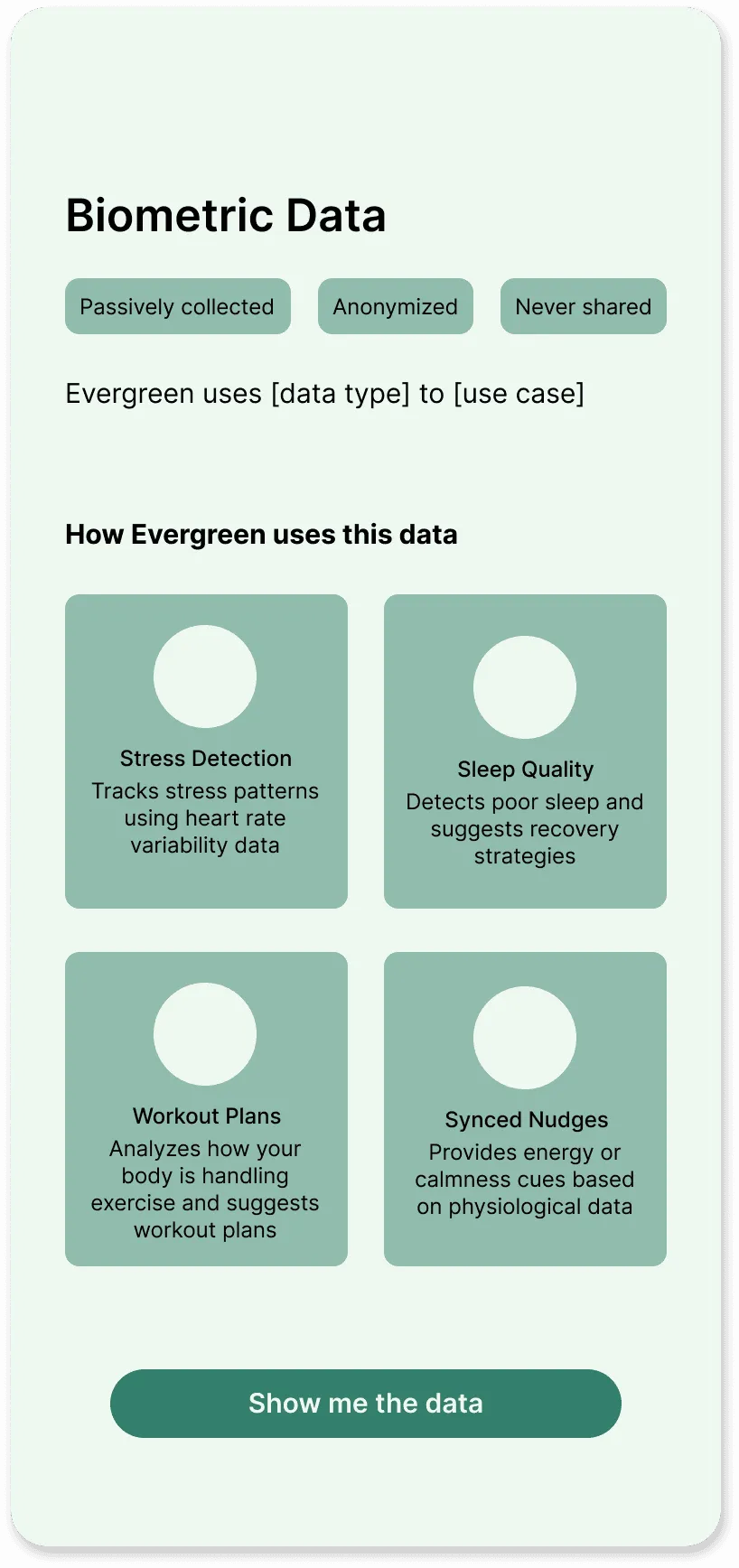
Interactive tiers to encourage permissions
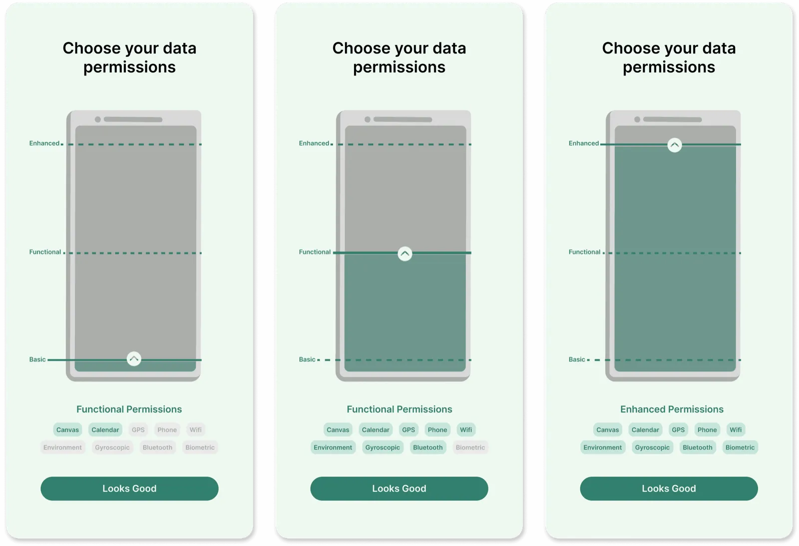
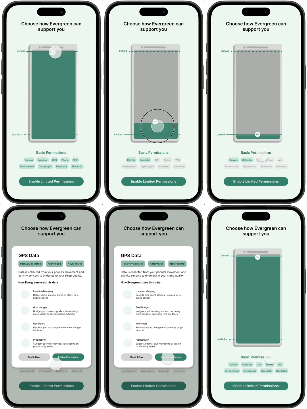
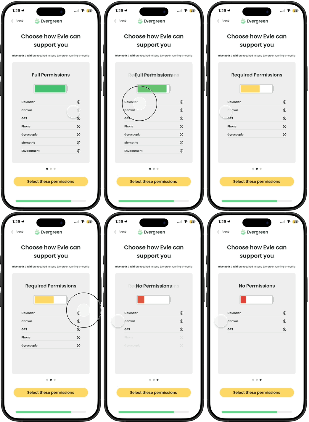
I created tiers of permissions to reduce the cognitive load of deciding which permissions to enable. I designed an interactive sliding permission meter with phone battery imagery to convey the idea that the more permissions were enabled, the more “powered up” Evergreen would be.
Iterating on details
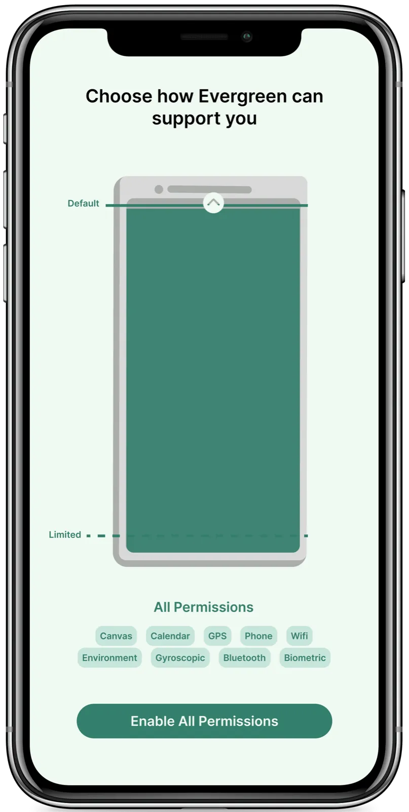
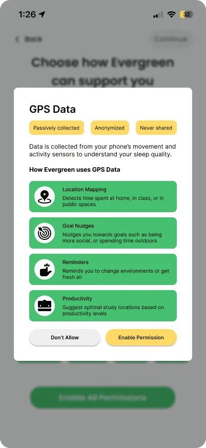
Changing to two tiers: During a team meeting, we worried that creating 3 tiers would lead users to default to the middle option. Thus, I changed the design to only incorporate 2 tiers and default to the higher tier.
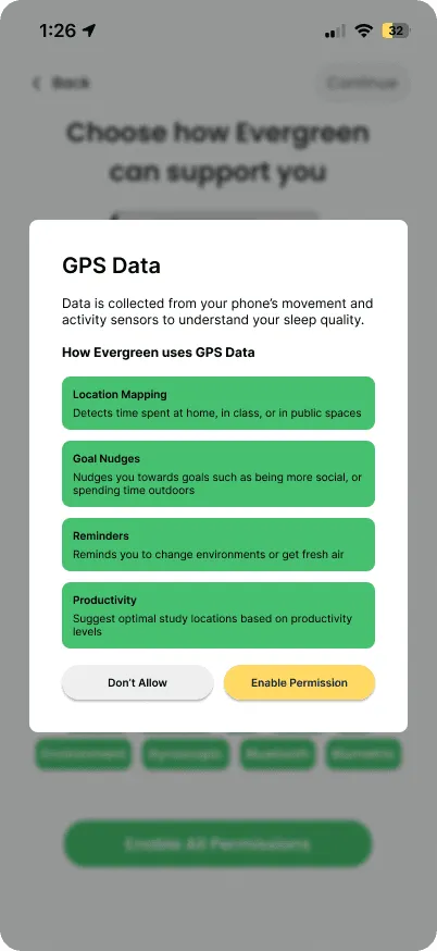
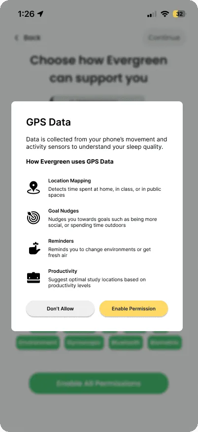
Microcopy: I made subtle language edits to focus on how Evergreen supports users to develop trust.
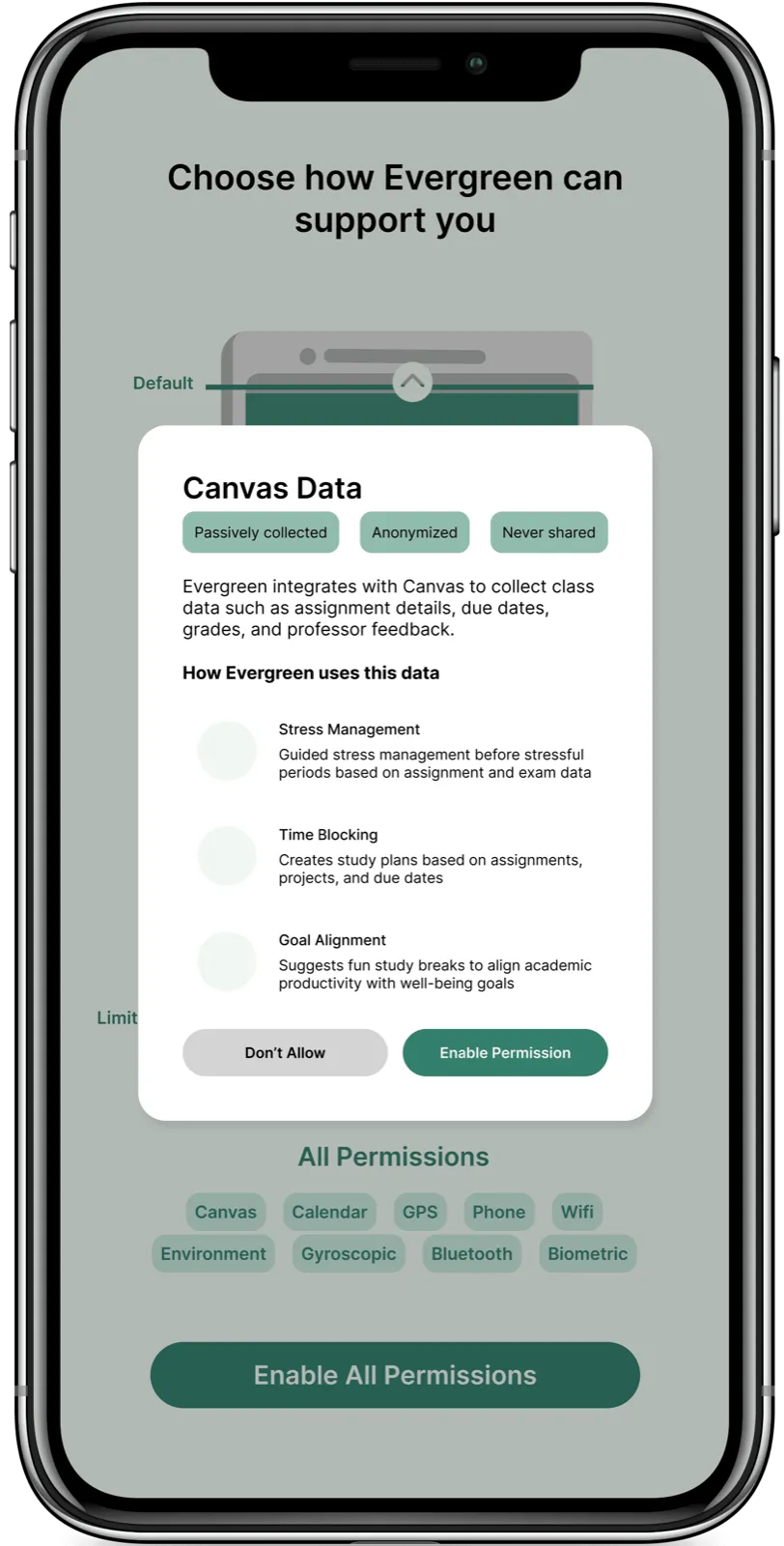
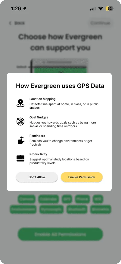
Incorporating pop ups: Following feedback from an external design mentor, I turned my data-focused screens into pop ups to bring in more of my original designs’ transparency.
User testing
While testing popups, we found something much more important…
The sliding battery wasn’t intuitive to users. Users were confused by the sliding battery. In testing zero users interacted with the battery or indicated that they understood how to adjust the permissions.
Pivot
Scrapping the slider
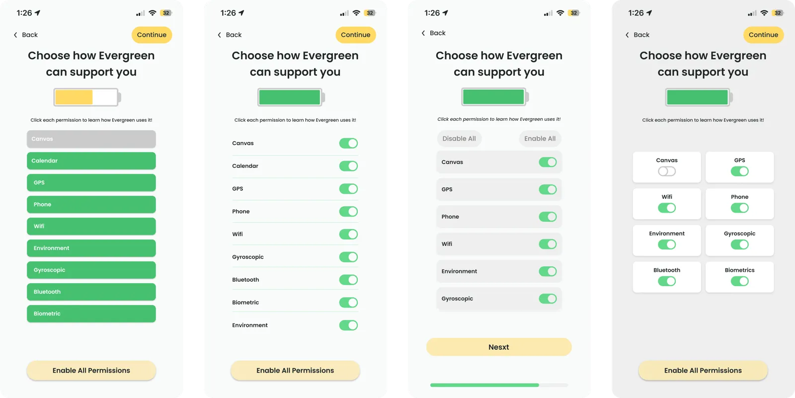
Though disappointing considering the term of work I had put into the slider, I scrapped it after the user testing. Instead I pivoted to new designs that emphasized the permissions, turning the battery from the core interaction into a visual indicator.
More testing & Pivots
More testing shows the cards don’t look clickable
I learned to run user testing much more often. When I gave my next iteration to users to test, I found that clickable cards still weren’t intuitive — 0% of users clicked on them, when the whole goal of shrinking the battery was to get users to open the popups.
Turning to familiar design systems
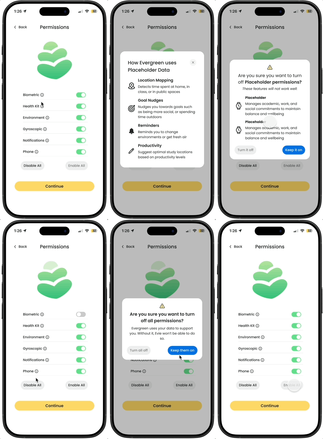
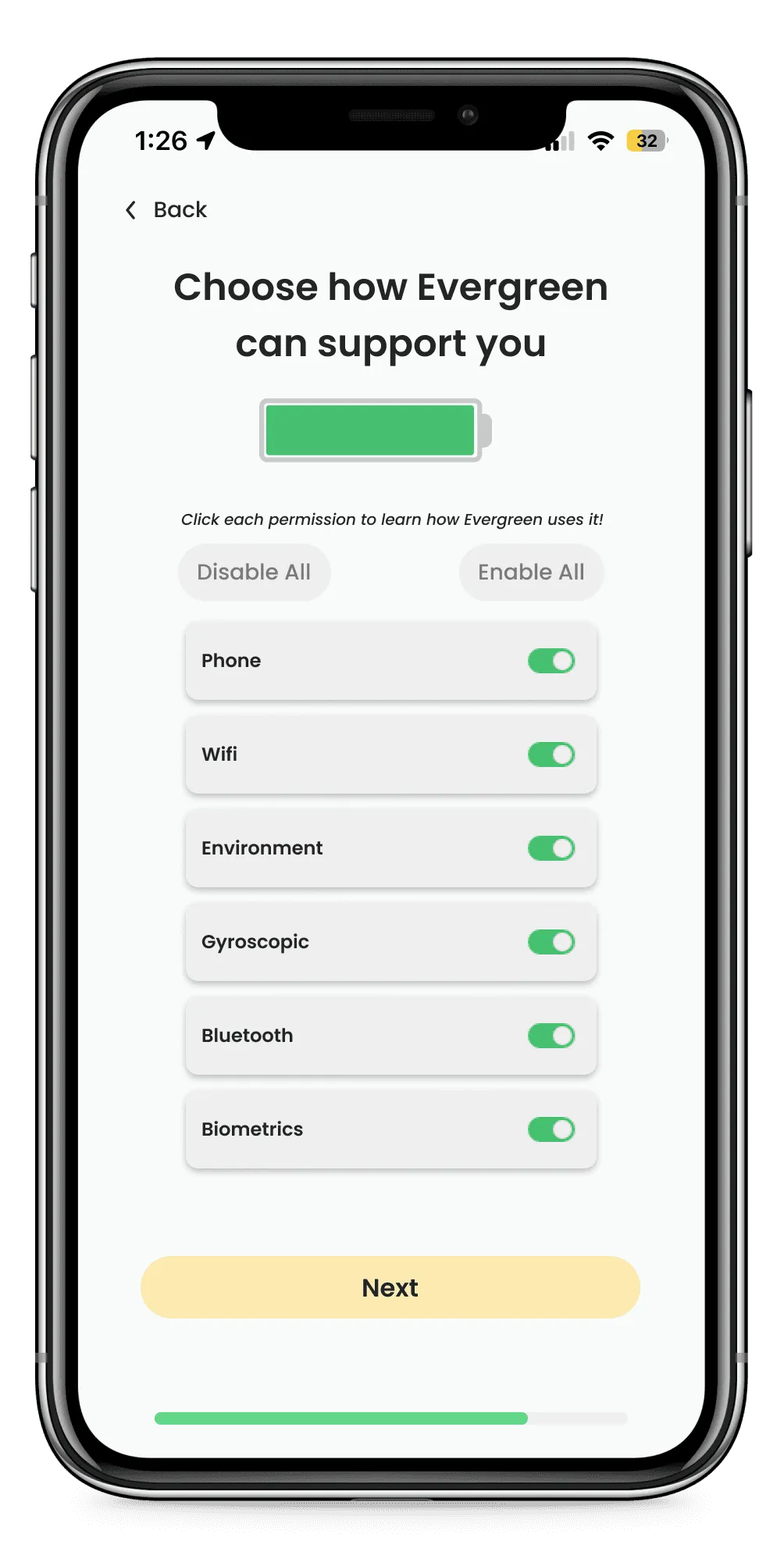
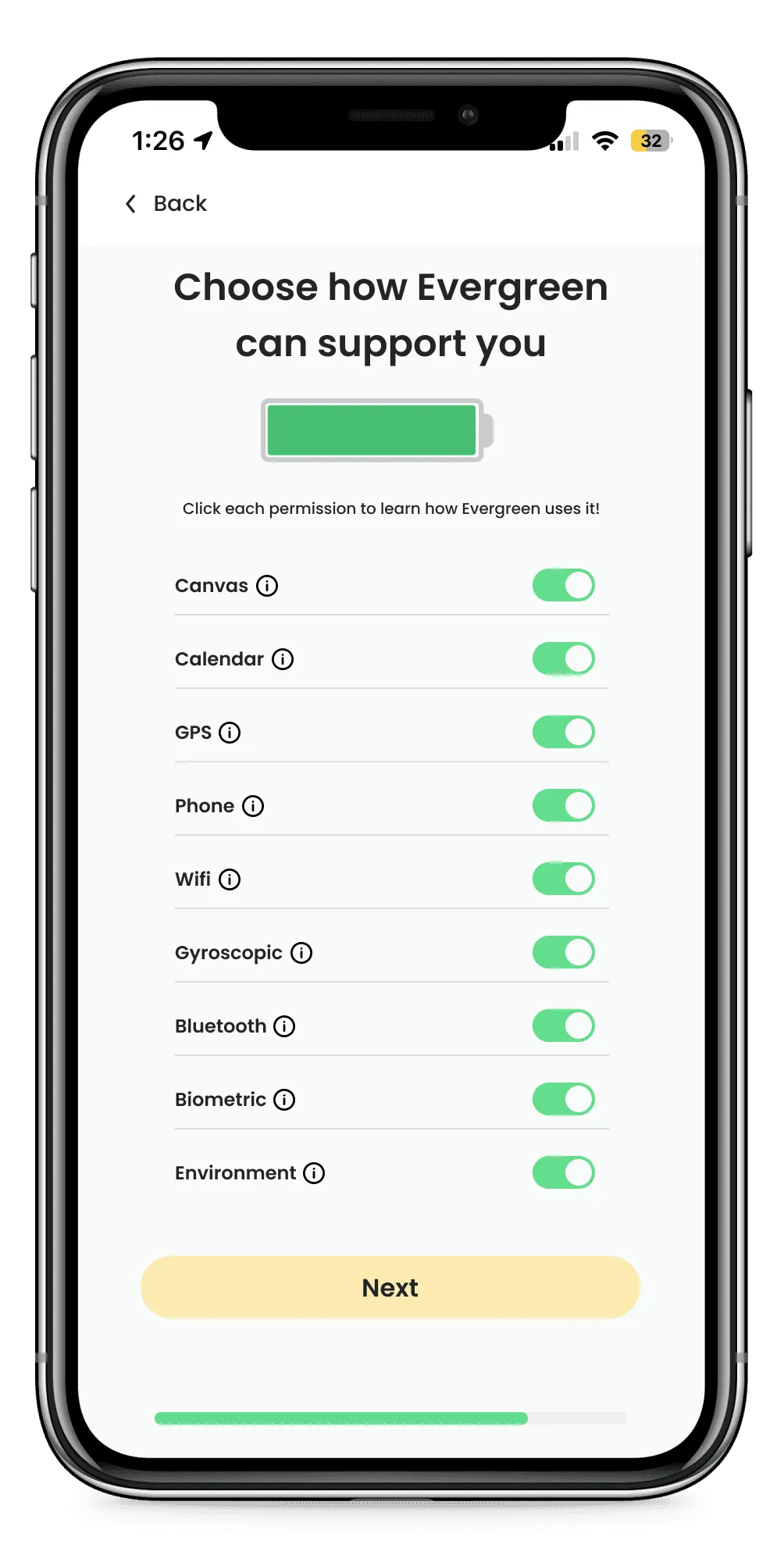
I learned to use familiar design systems. I added the universal “i” button as a clear indicator for more information. This made the design much simpler and in user testing, 100% of users stated that they knew where to go if they wanted to find more information.
Adjusting the design to fit toggles
After changing the design to be toggle-based with the “i” button, there were a few mechanics from the old design to work out.
How to show required permissions
Removing the slider feature made it hard to show required permissions. I experimented with different ways to communicate which permissions were required, and grappled with transparency vs functionality. Ultimately in a conversation with partners, we decided to omit required permissions from this screen and simply have users approve the native permission alerts.
How to reduce cognitive load?
The toggle design lost the sliding battery’s tiers that helped reduce the cognitive load of deciding which permissions to enable. I experimented with creating distinct tiers but instead opted to add enable all and disable all buttons for the same two-tier concept but in a more familiar format.
How to discourage permission disabling?
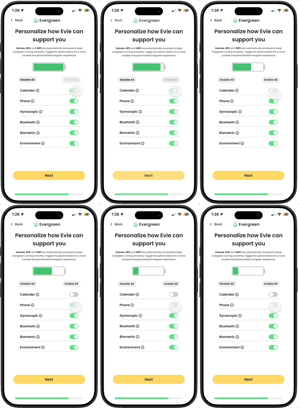
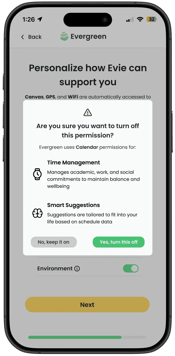
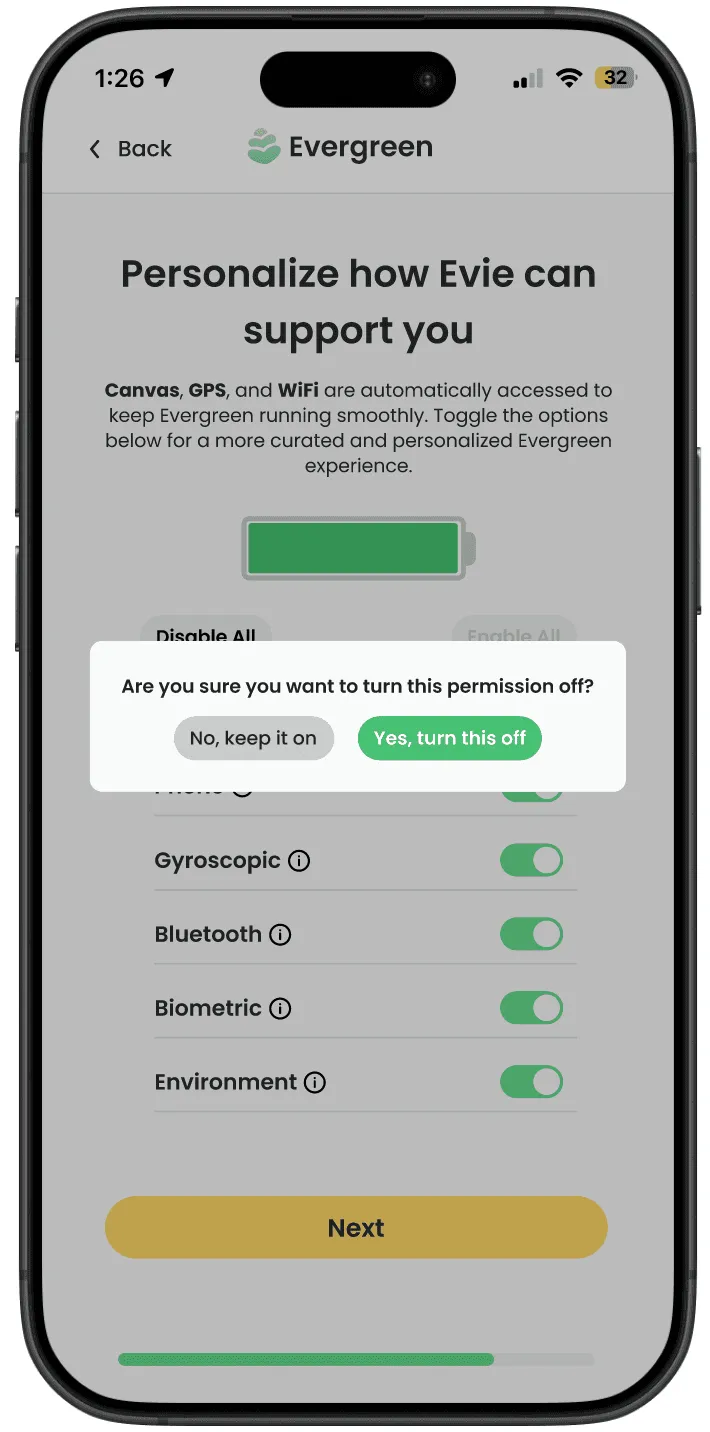
To create more friction for users disabling permissions, I designed a pop up before a user could disable a permission. I tested 2 designs and 100% of users preferred the more detailed pop up.
The Final Design
The final design is a clean, intuitive permissions screen that balances data transparency while encouraging users to enable more permissions.
Reflections
I owned the design of the permissions screen over the course of three terms. Given the ambiguous nature of Evergreen, I learned how to evolve the design throughout the changing stages of the project. My main takeaways from the project:
Test early and often!
I learned first hand the importance of user testing early and often. Due to not testing a core feature of my permission screen (the slider), I was forced to pivot on a design I had spent 10 weeks developing.
Turning stakeholder disagreements into research questions
Over 3 terms with 3 different teams and 5+ regular partners, Evergreen had more stakeholders than any project I’d worked on. I quickly learned that trying to resolve disagreements in meetings was unproductive, and often not everyone could make it. Instead, I learned to turn disagreements into user research questions. Even if I just ran the questions by a few students, bringing data to the meetings made for much more productive conversations.
Learning when to innovate and when to hold back
Innovating too much on the permissions page — a page users are very familiar with — led to a confusing interface that users reacted poorly to. In order to effectively communicate information, it had to be presented in a familiar way. Innovation was more effective in the small details, such as adding a pop-up before users could turn permissions off, or a small indicator showing Evergreen “charging up” as users enabled more permissions.