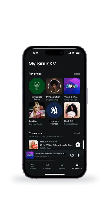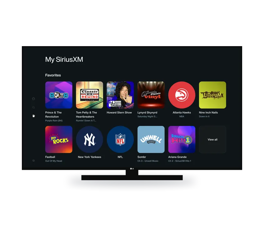
In 5 weeks I designed 3 badges, conducted 2 UXR studies, and shipped a 3-arm production test.
Explicit badge
Purpose
Discretely disclose the explicit nature of a channel.
Behavior
Users should be able to find the badge if they are looking for it, but it should not disrupt those who are not.
Current state
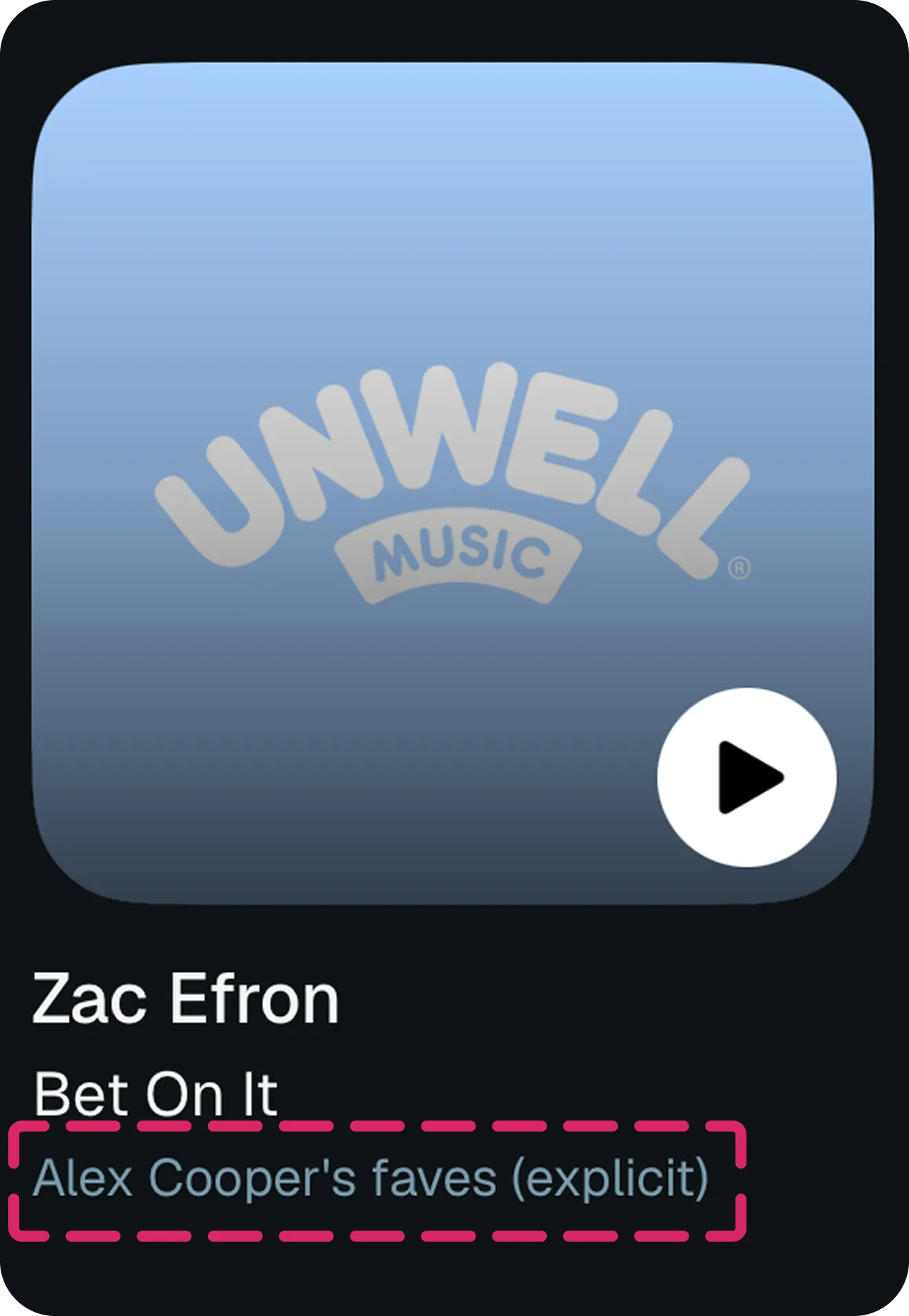
SiriusXM did not have an explicit badge, and thus explicit channels were denoted by (explicit). My role was to determine the design and placement of a new explicit badge.
Channels can appear in 4 set styles
Importantly, SiriusXM can only badge at the channel level, not the track level. So, I began my designs looking at the different sets that channels could appear in on SiriusXM.
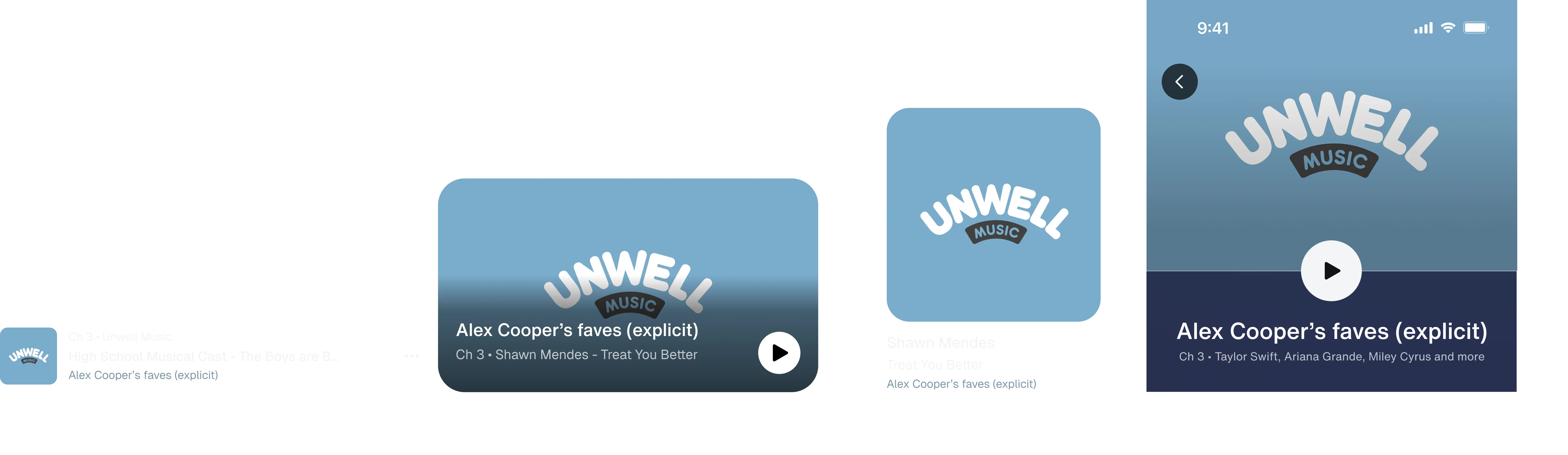
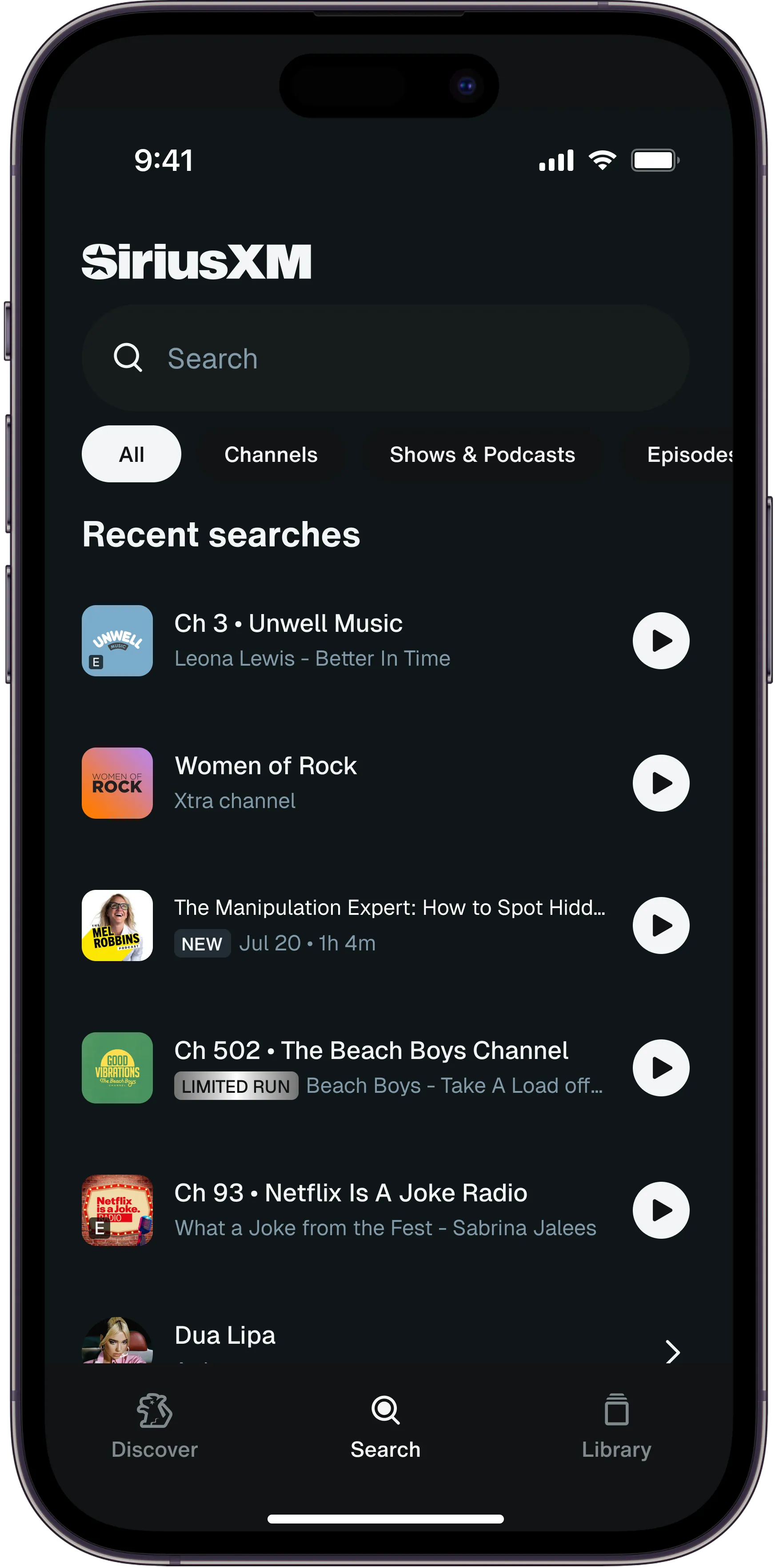
Tiles, heroes, entity pages carried channel metadata in the subtitle
This made it easy. Since we wanted the explicit badge in a subtle but easy to find location and the channel information was already in the subtitle, I put the badge in the subtitle.
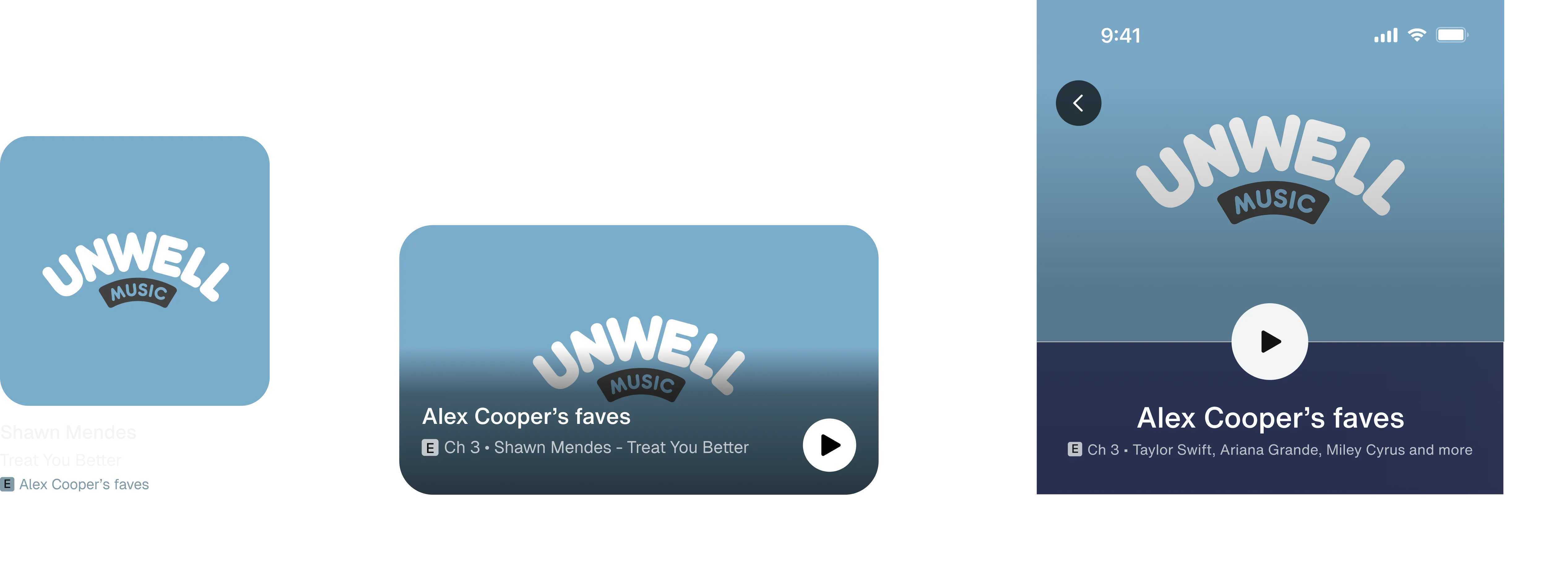
Lists were the hard case
List sets had channel metadata everywhere. The channel number in a list item could appear in the eyebrow, the title, or the subtitle. That meant there was no easy spot the badge could attach to consistently.
So to badge list items consistently, I placed the badge over the artwork. This allowed for channel level badging while still maintaining a consistent position across all list items.
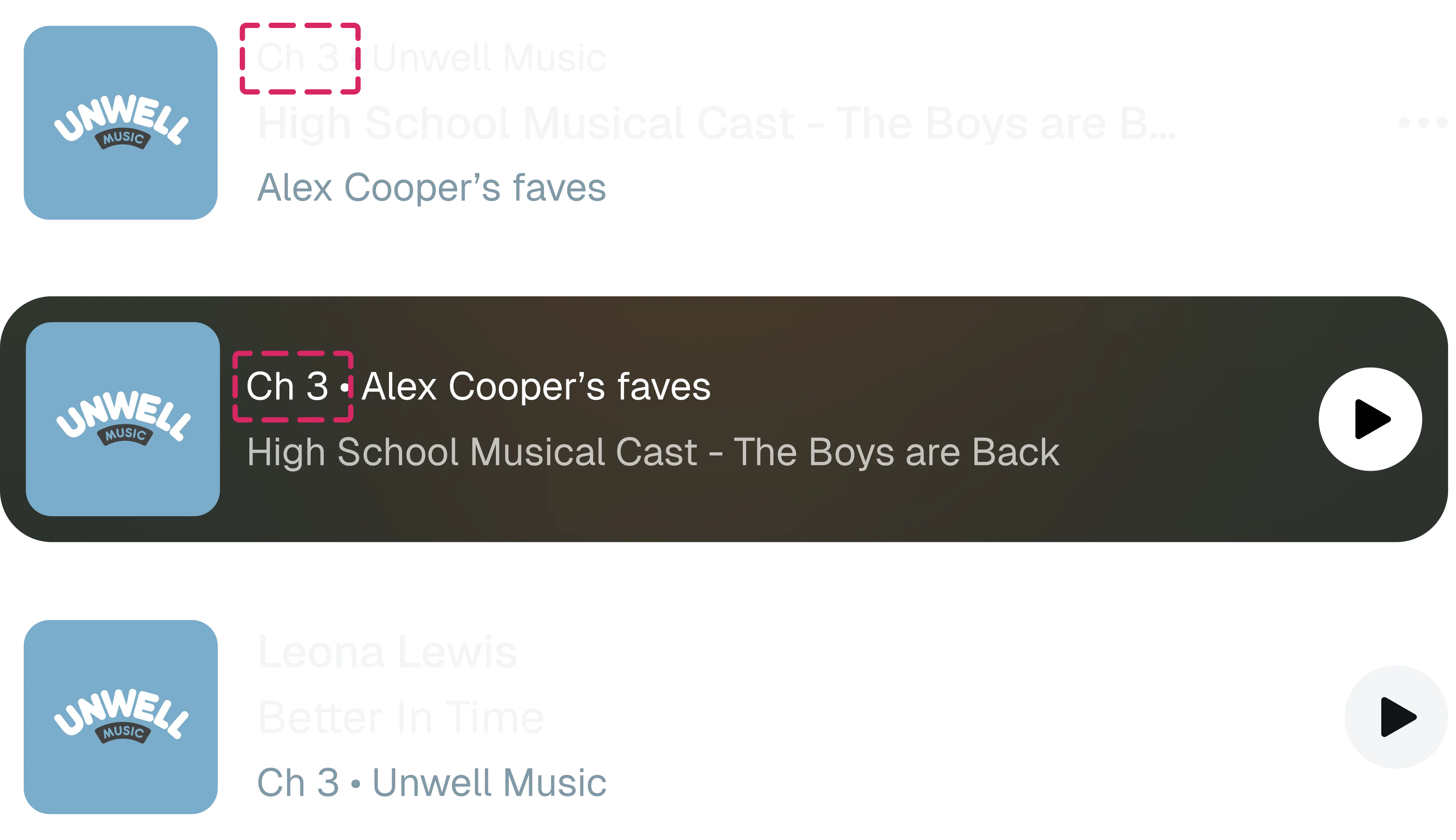

The full original recommendation
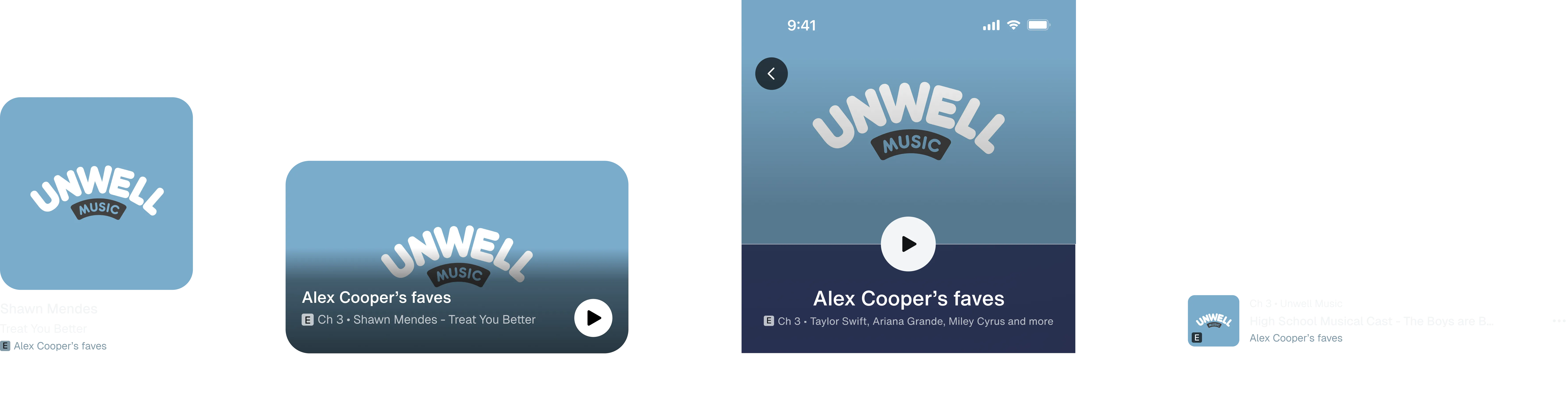
Testing with users
Under the guidance of a senior UX researcher, my PM and I designed and ran 2 unmoderated user tests, talking with 65 users total. We tested for badge comprehension, findability, and preference.
UXR revealed two concerns:
- Only 55% of users identified the E badge as explicit, lower than we expected.
- 40% of users didn’t see the over-the-artwork badge for list sets.
With two new concerns from user testing, I went back to industry research

What I found:
- ALL platforms used E to mean explicit, and a majority never spelled out “explicit”.
- NONE of the platforms used over-the-artwork explicit badging.
These findings confirmed our need to reconsider the explicit badge for list sets, but it assured us that explicit comprehension wasn’t as big of an issue since we were aligned with industry standards.
We also presented our recommendation to stakeholders
This presentation reaffirmed our position. Stakeholders didn’t want explicit spelled out at any level, saying “[the spelled out badge] looks like its screaming at me.”
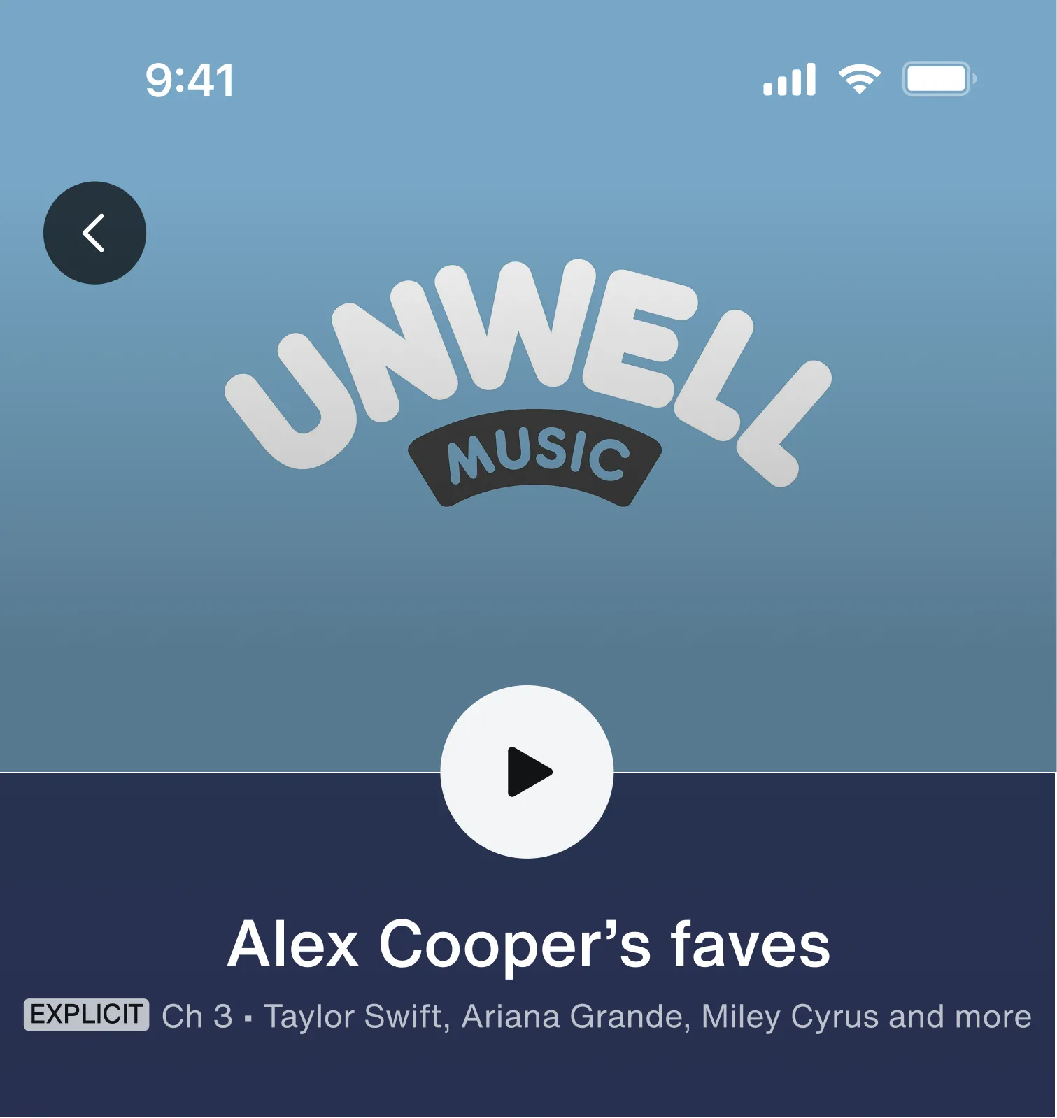
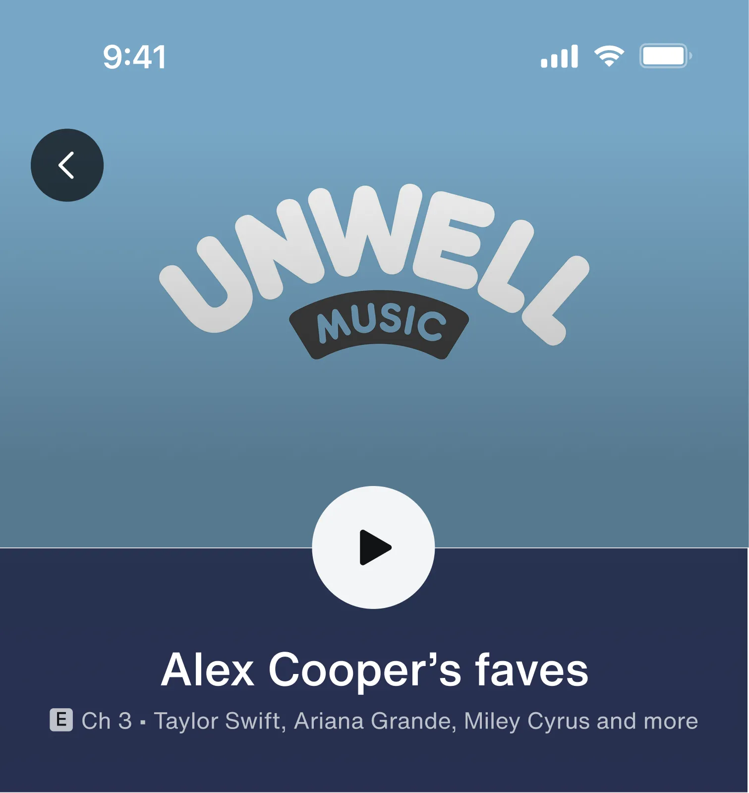
However, the stakeholders did want to change the over-the-artwork design, mentioning it looked off.

Redesigning the list set recommendation
I revoked my original recommendation to put the badge over the artwork for list sets. Since 40% of users missed it there, 0/7 platforms used this pattern, and key stakeholders called it an eyesore, I had to do something different.
This time, instead of lumping all list items into the same placement rules, I separated individual list sets by metadata since that was what impacted explicit badge placement.
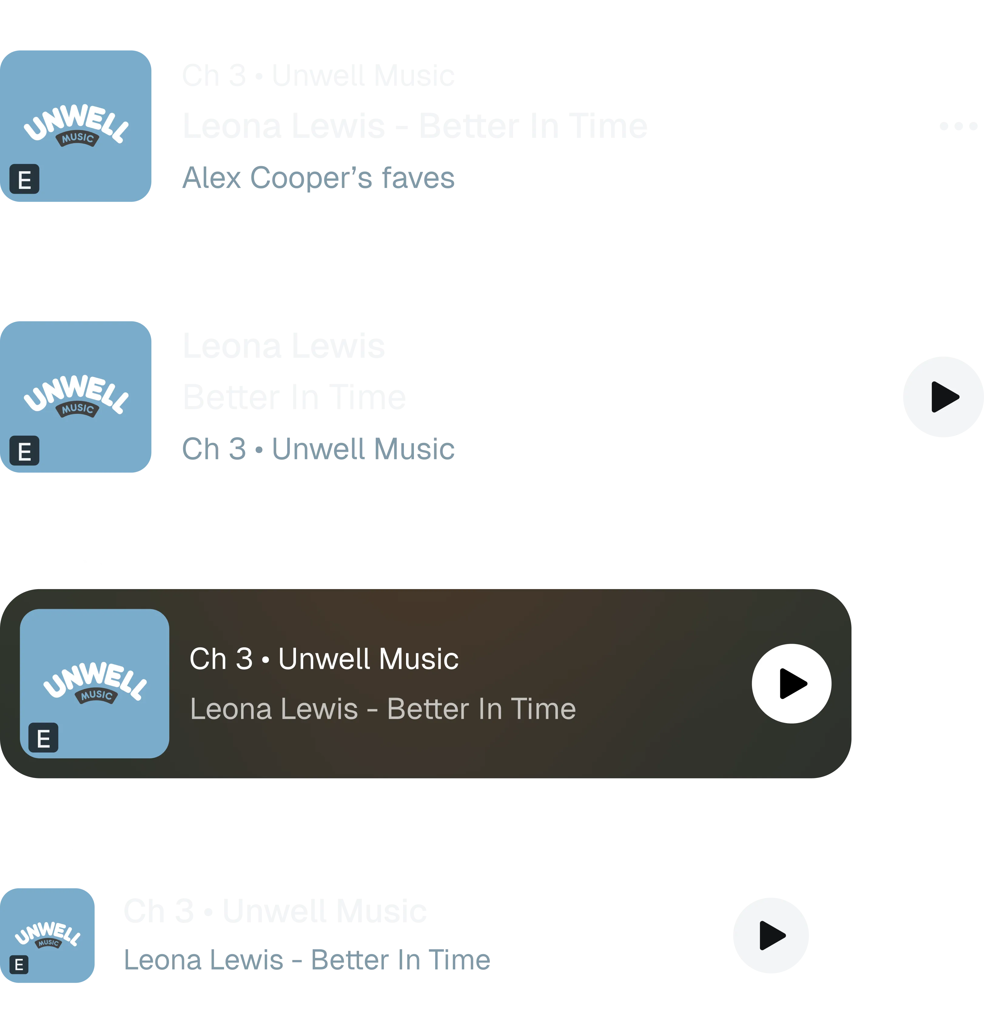
There were only 2 places the channel data could be
-
In the title
-
In the subtitle
Note: Previously we had been looking specifically at channel number. This time we were looking for any channel-related metadata.
The subtitle sets were easy to adjust
They already fit the pattern of the other explicit badges, thus I just moved the badge to the subtitle to match the tile, hero, and entity page pattern.
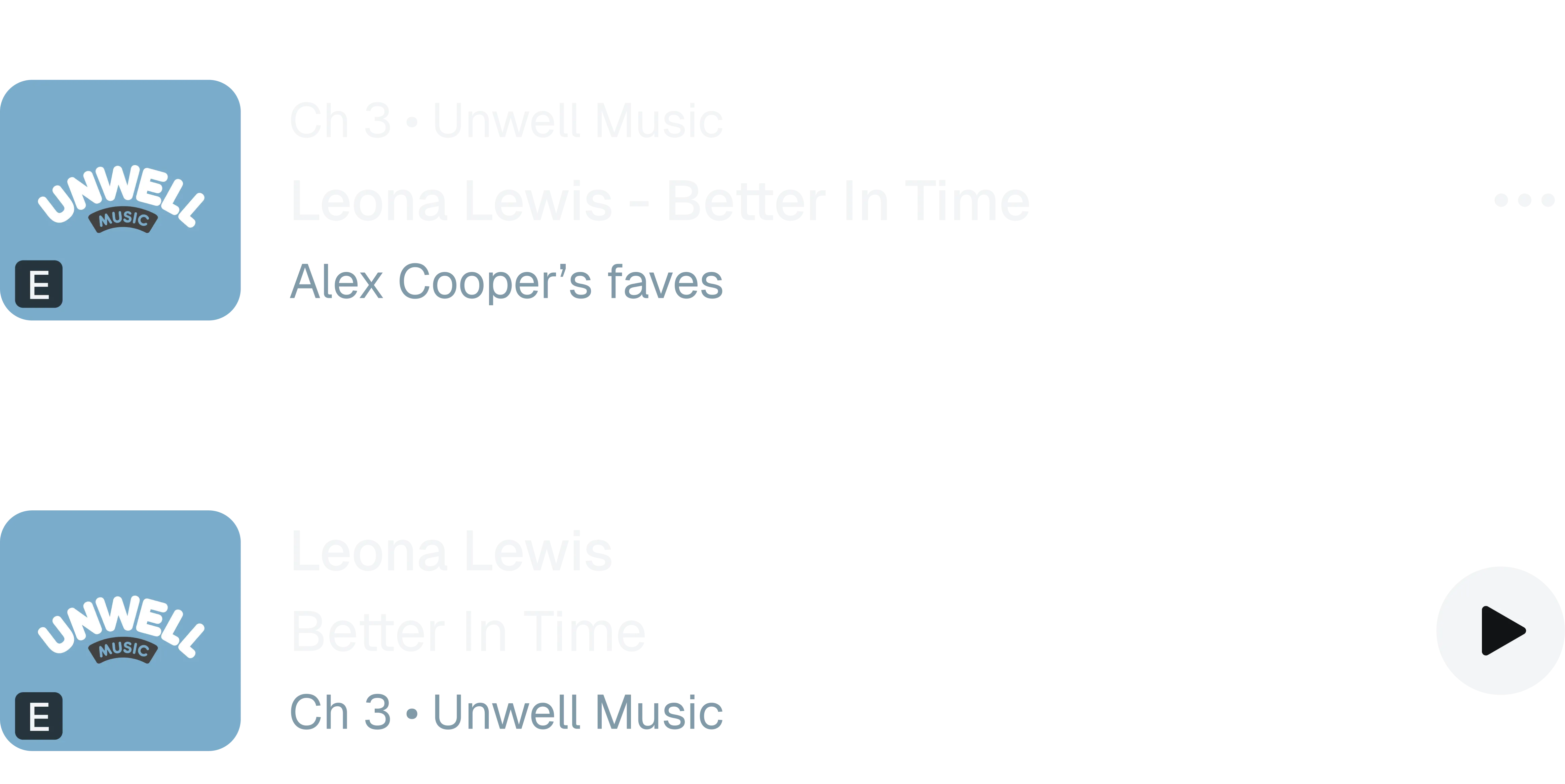
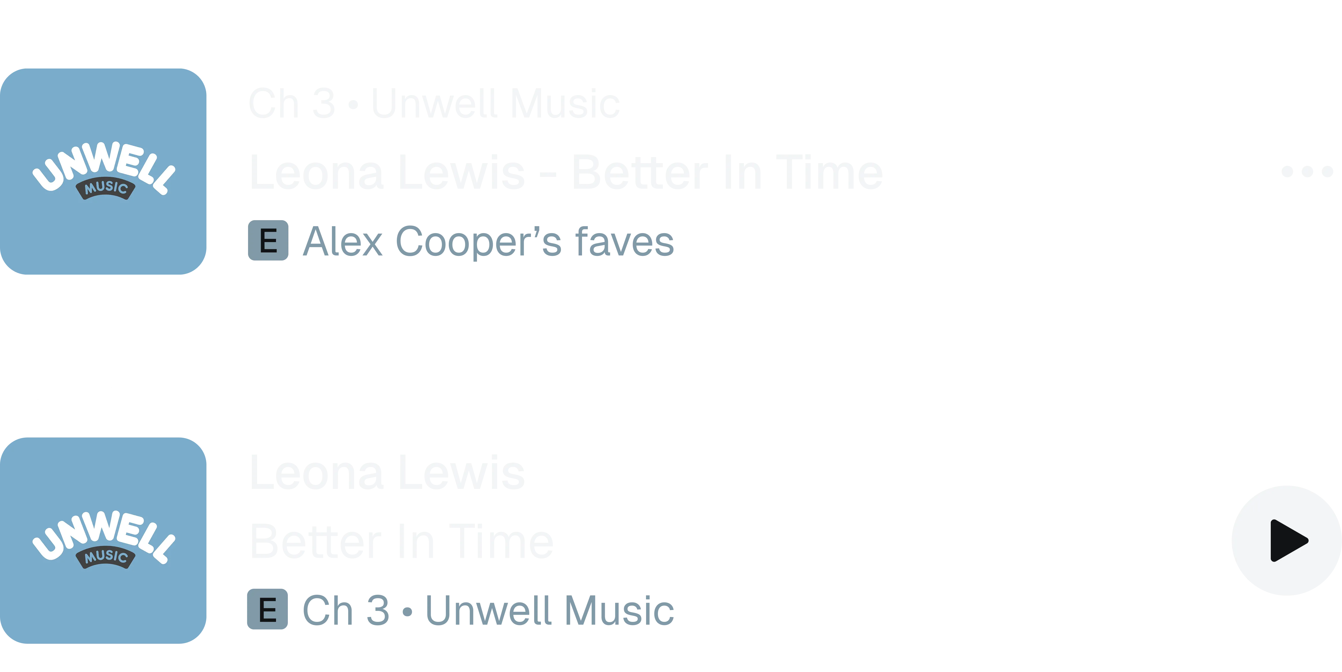
However, the title sets required a new pattern
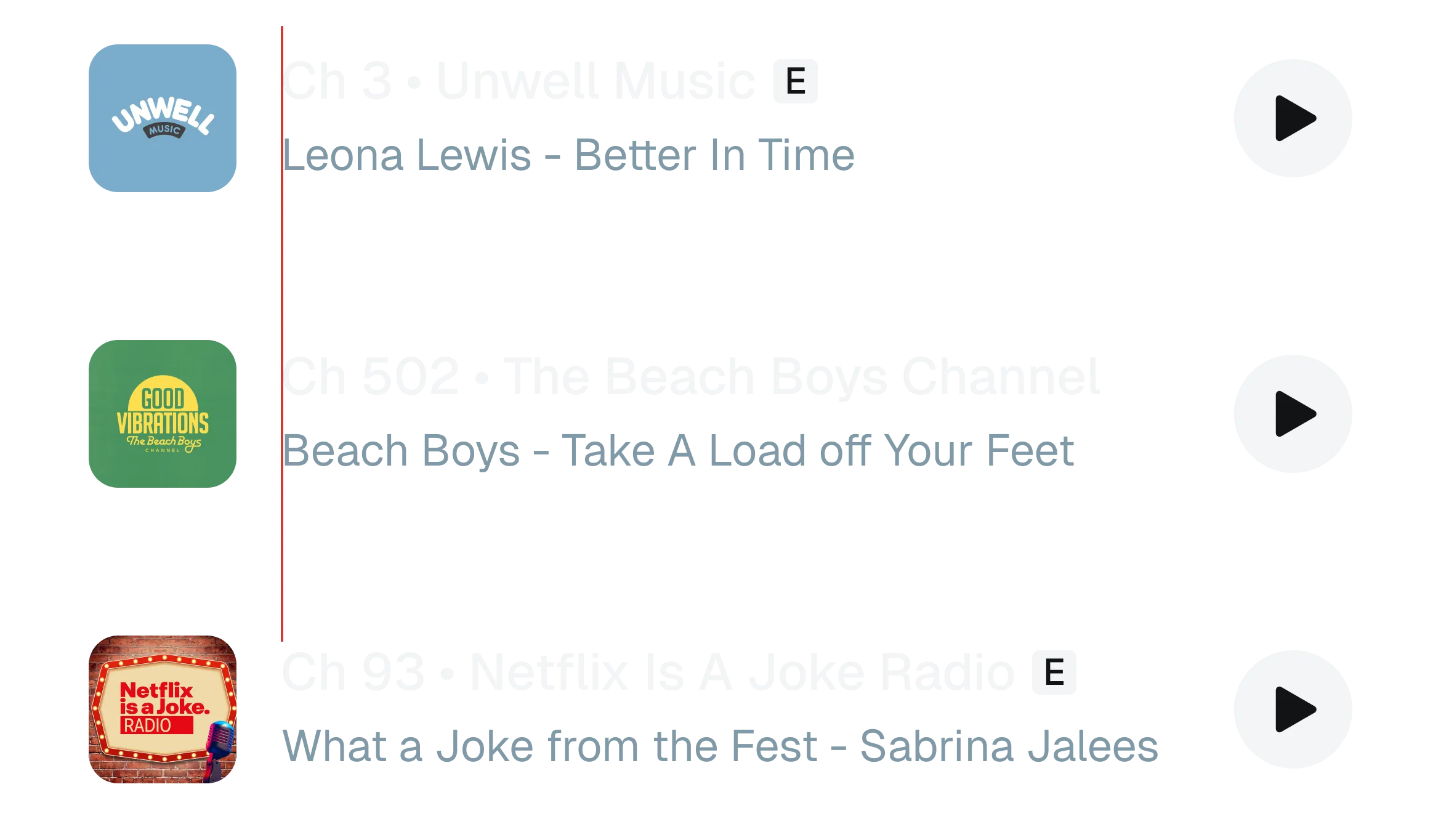
In the search surface, channel metadata had to be in the title due to users searching for channels by number. Further, the subtitle spots were taken by track metadata. So the explicit badge had to go in the title.


But should the badge go on the left or the right? The group said left
Originally, the working group leaned heavily towards left-side badging in the title in order to maintain a consistent experience with not only other explicit badging, but all of SiriusXM’s badging.
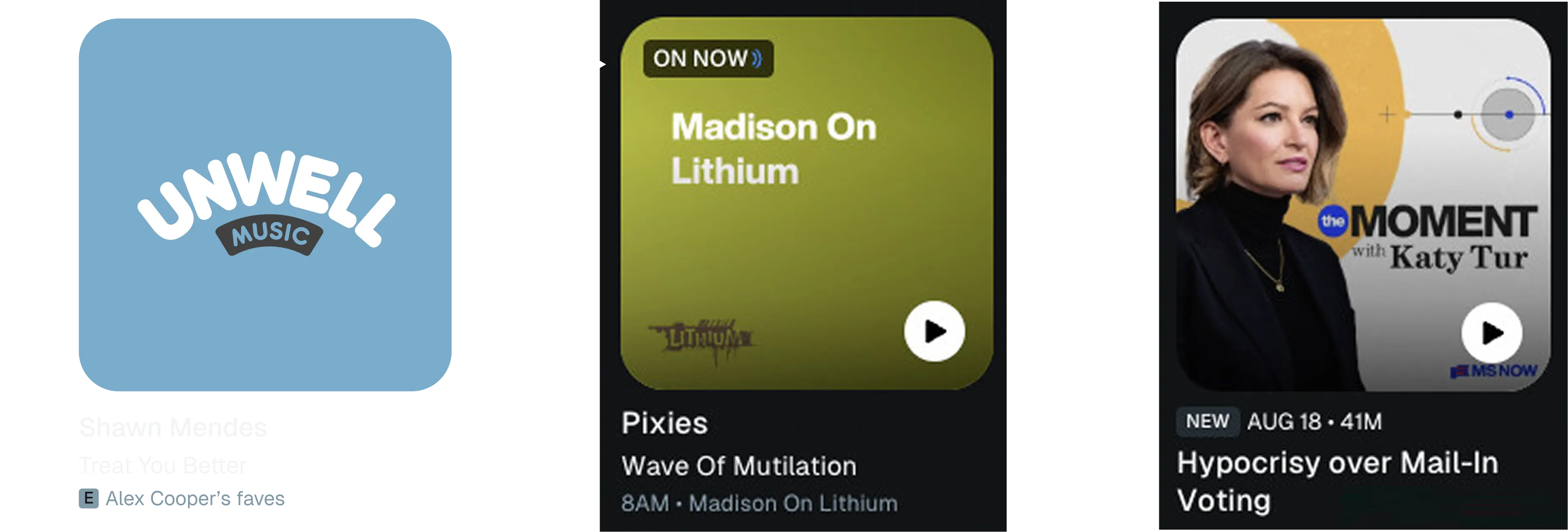
But I argued against badging on the left
I argued that consistent placement is not necessarily a consistent experience. In this case, the same badge placement (left side) leads to two entirely different experiences.
Despite badging on the same side, the title badge stands out much more
Even though the badge is technically more consistent on the left in the title, it creates a whole different user experience as it becomes the first thing users read. Thus badging on the right would be more consistent with the left side subtitle badge.

Badging on the right in search maintains experience better than the left
Even though the right-side badge is inconsistent with the left-side precedent, it maintains the current experience better, allowing users to scan channel numbers quickly.
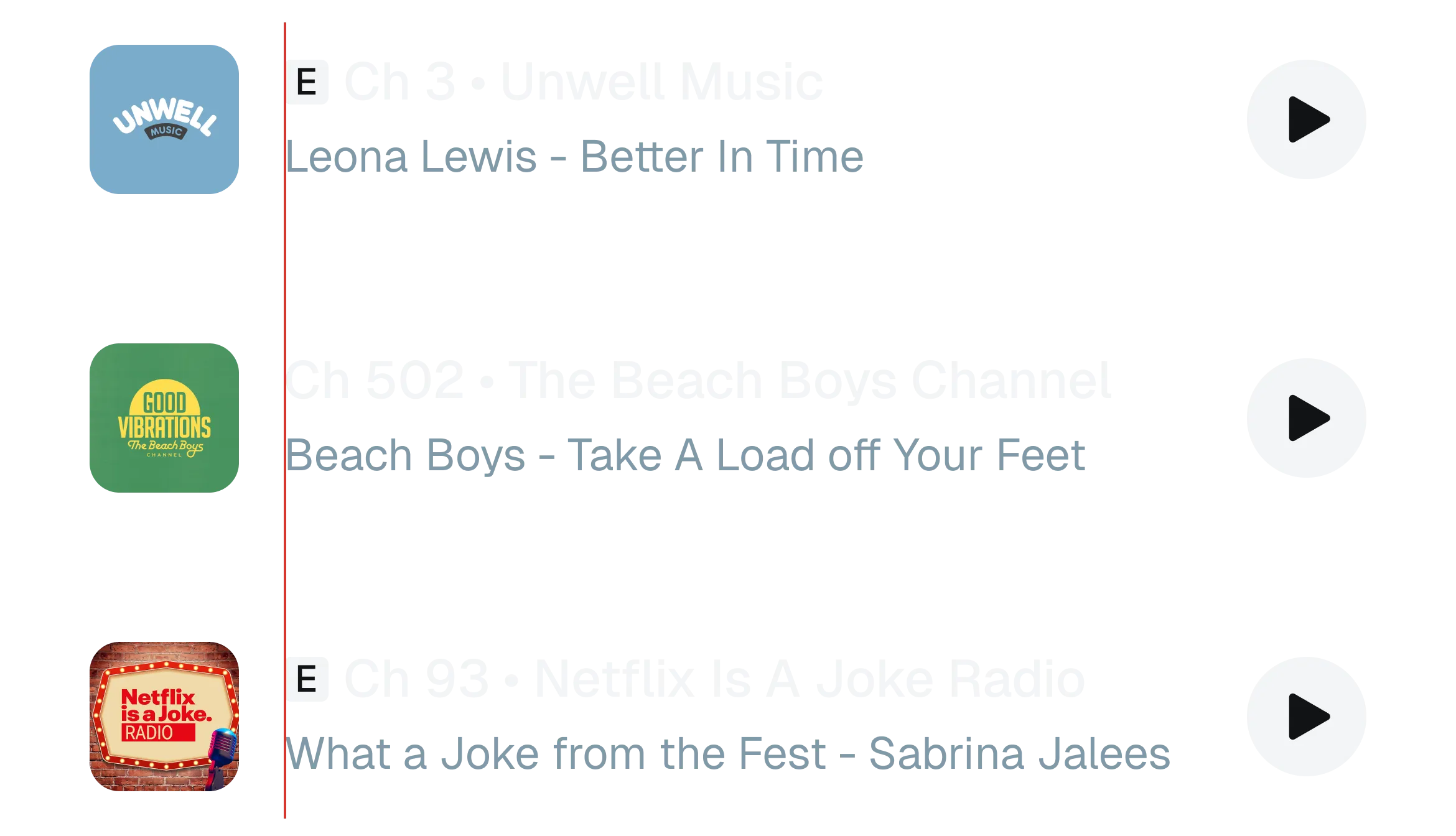
I created a framework to decide
Ultimately, there were strong cases for badging both on the left and the right. In a presentation to leadership, I proposed a ranking framework that categorized each factor and how important it was:
Purpose
What the badge is meant to do
Interaction with content
How the badge changes how content around it is interpreted
Consistency
Consistency within the system or industry
Interaction with other badges
How the badge impacts how other badges around it are interpreted
Using this framework made it clear that badging on the right was the overall more beneficial position. Badging on the right was preferable in terms of purpose and interaction with content (the two most important factors). Further, both badges had reasons relating to consistency that were of similar weight. Leadership agreed and we revoked the original left-side badging for right-side badging in the title.
We shipped right-side badging in the title for all search list sets
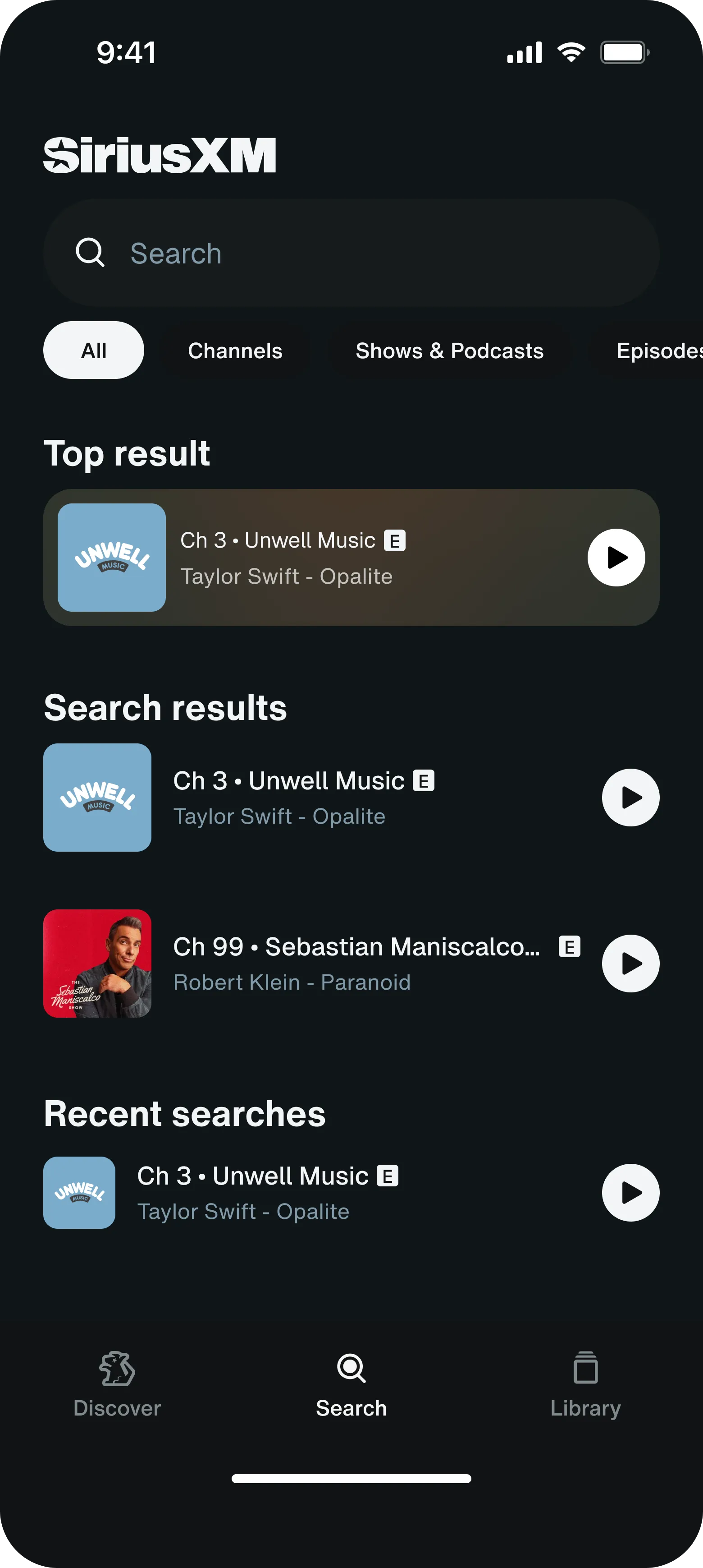
Note on truncation: The cost of badging on the right was truncating 2-line titles to one line. I worked with design systems to scope a future E-badge glyph so that explicit would appear in-line rather than forcing truncation. We decided that in the meantime, the one line truncation would be acceptable given the rarity of 2-line channel titles.
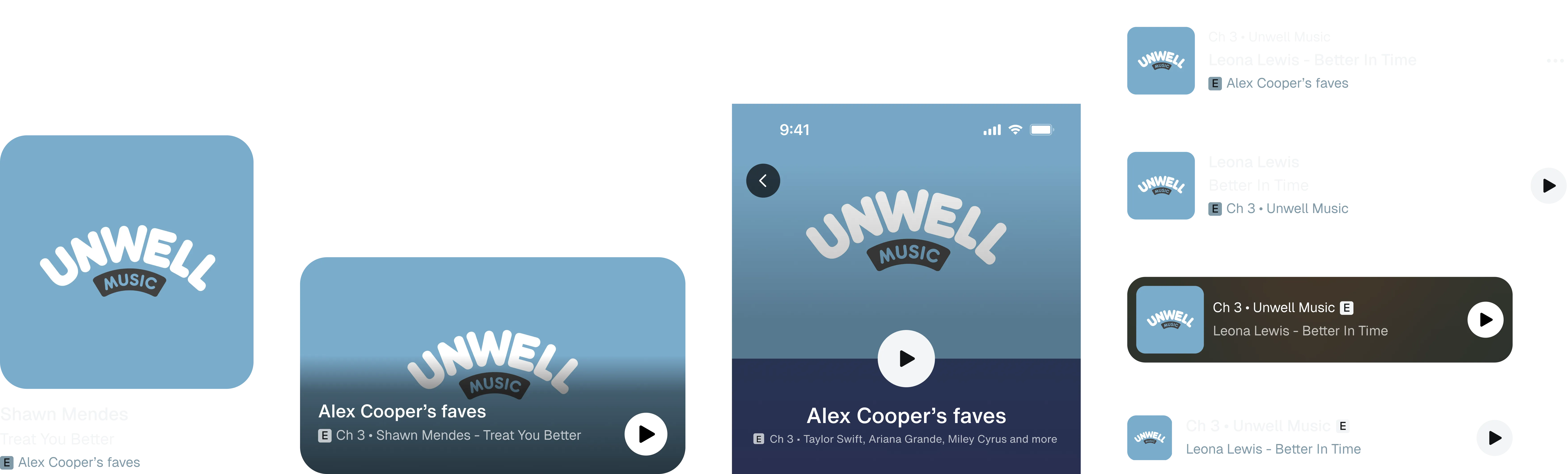
The final explicit badge design, approved to ship
Limited run badge
Purpose
Promote a channel that is only available for a limited time.
Behavior
The badge should be noticed, signal that the content is temporary, and drive users to listen before it goes away.
I designed the badge to be eye catching
Initially, I began explorations for this badge under the assumption that a badge meant to promote should be designed to grab attention. Thus I explored color, special treatments, and animation.
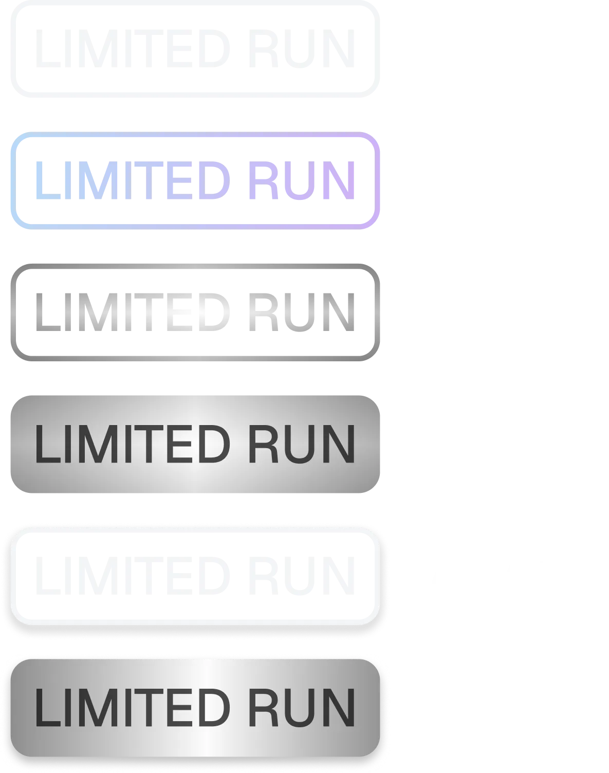
The animated silver badge was chosen among the working group based on preference.
Note on motion scope: I collaborated with design systems to scope the motion to mobile and web designs, intentionally leaving it out of automotive designs (risk of distraction) and TV designs (lack of bandwidth).
But leadership had two concerns…
01Motion on one badge sets a precedent for future badges
The first concern raised at the read-out was precedent: if limited run gets animation, every badge that comes after it will want animation too. So I created a framework that bounded it. Motion is reserved for badging content that is temporarily available. This follows the LIVE badge precedent which already uses motion this way.
02Does emphasis drive engagement?
Essentially the question was, in order to promote content does the badge need to draw attention? Or, does it need to communicate clearly. This was a question I couldn’t answer alone. Thus, we put the designs to the test. Ultimately, I shipped a three-arm production test, where we will be measuring the difference in level of engagement across 3 treatments of the limited run badge.
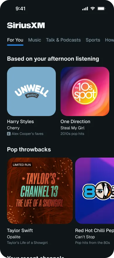
Arm A: Standard badge
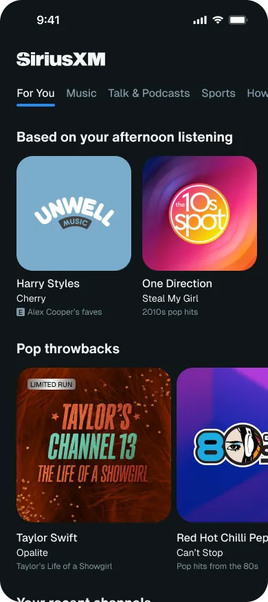
Arm B: Static shiny badge
Arm C: Animated shiny badge
Reflections
I learned the value and limits of user testing
The opportunity to conduct a user test with 65 users on my designs was incredibly special and I learned so much from the experience. First, the comprehension problems with the explicit badge was very unexpected, and I learned how even the simplest assumptions can be wrong. However, what was more interesting about this experience is that we ultimately decided not to change the “E” design to improve the 55% comprehension rate. This experience gave me a clear look at the other factors that impact design decisions (design systems, industry standards, stakeholder goals, etc.). I learned that while valuable, user research isn’t always the final answer.
I learned the value of late-stage industry research
In previous projects, I had always conducted industry research at the beginning of a project as a means to gather inspiration and spark ideas. In the explicit badging process, I returned to industry research much later in the process. Instead of looking for inspiration, I was inspecting the industry for specific details and choices. This gave me a whole new perspective on industry research and I saw the importance of really understanding and knowing the industry precedents and making intentional and informed decisions when deviating from it.
I learned that going back to the principle is key
Throughout the explicit badging process, all the decisions I made ultimately reinforced the core purpose of the badge — to disclose information discretely. Even in limited run, though the design ultimately ended on a question, it was a question about purpose. This project taught me to consider a design’s purpose carefully at the beginning, and to continue to reference its at every decision.
Thank yous
Special to Helen Cui, my PM, and Kelsey Wort, our UXR expert, for making the user testing possible. Further thanks to Michelle Hsu and Joshua Claassen for managing and mentoring me through this project, and to Ryan Lutterbach for office hours that shaped my design process and taught me to think in frameworks.
What’s next
This project is currently approved to ship and pending implementation. After it’s pushed to production, the final limited run badge design depends on the results from our ABC test.
As a design intern, Ellie showed really strong UX instincts in understanding the problem, gathering relevant competitive analysis and research, and asking questions about the various metadata contexts for badging before jumping into solutions. She was always prepared with her rationale and how her proposed solutions fit into the broader system beyond the immediate screen or component. Way to advocate for the user and your own well-reasoned perspective, Ellie!
 Tricia PalermoContent Designer
Her ability to pick-up and work through the badging space was fantastic! We likely would not have been able to quickly pick up that project if it wasn't for her, so she was able to help us deliver against a program in a quick, collaborative way.
 Paul ArmstrongProgram Manager